Now Closed – Entries for the 2017 Dulux Study Tour

Celebrating its 10th anniversary, the 2017 Dulux Study Tour is your opportunity to be part of an exciting and coveted program that inspires and fosters Australia’s next generation of emerging architectural talent. Winners will embark on an exciting architectural tour of Prague, London and Barcelona where they can experience firsthand some of the best architectural sites and practices.

The entry process is now closed.

Entry into the 2017 Dulux Study Tour is a two stage process:

Stage 1
To enter, entrants are required to submit their answers to four nominated questions, their contact details and details of their employer via the online entry system.

Stage 1 submissions closed at AEST 11.59pm Thursday 15 September 2016.

Late submissions will not be accepted. Entrants’ answers to the nominated questions will be judged, and shortlisted entrants will be notified to enter into Stage 2.

Stage 2
Shortlisted entrants must upload via the online entry system an A4 document that includes: one written employer reference, resume (maximum two pages), portfolio of works (maximum of four pages). Submissions for stage 2 will be open from Thursday 13 October 2016 when shortlisted entries will be notified of the outcome. The closing date for Round 2 is 11.59pm AEDT Friday 4 November 2016.

2017 Dulux Study Tour Terms and Conditions

DAY 11: WHAT WAS YOUR FAVOURITE BUILDING?

The final day of the tour has crept up on us, mixed feelings gather as we enjoy our last luxe breakfast together – making sure we have enough fuel to make the most of another hectic day.

Today we have visited the studio of AGI Arquitectos, Amid/Cero9’s project the Giner de los Rios Foundation, the studio of Langarita Navarro and their project the Prado Medialab, Andres Jaques’ Excavarox at the Matadero and finally the house and studio of Selgas Cano.

sc1

Finding time between visits we reflect on our tour highlights, ‘What was your favourite building?’  A simple question that must be answered instinctively, based on feeling and not too much thought – kind of like the way you’re meant to answer the Myers-Briggs personality test.

sc2

What was your favourite building?

Hannah: Bagsvaerd Church by Jorn Utzon

Katy: Brunswick Centre by Patrick Hodgkinson

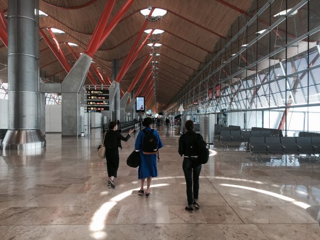
Chris: Barajas Madrid Airport by Rogers Stirk & Harbour

Mathew: Leadenhall building by Rogers Stirk & Harbour

Qianyi: Silicon House by Selgas Cano

These buildings can tell you a lot about our personalities… calm and collected Bagsvaerd church, social and genuine Brunswick centre, formidable and inventive Leadenhall, warm and welcoming Madrid Barajas airport, colourful and playful Silicon house.

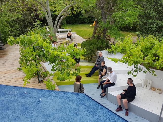
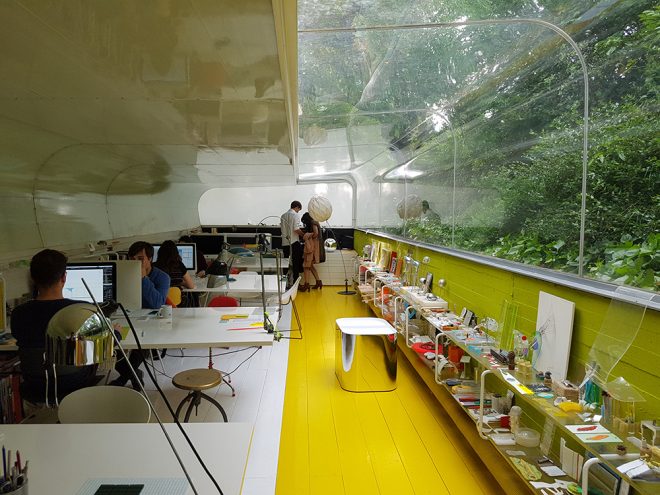
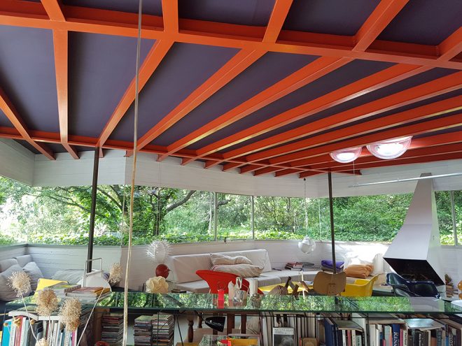
We arrive at Selgas Cano’s at the end of the day. It is located about 30 minutes on the motorway from the centre of Madrid, in a private and wooded suburban area. I feel like we’ve entered into an oasis where the natural landscape has buried the built architectural structures of the studio and Silicon House. The rectangular, half sunken form is part bunker part terrarium – designed so that the studio of SelgasCano could work under the trees, one feels at peace here and ready to dream.

sc3

We are all taken by the playful nature of the Silicon House, graded pathways, transparent layers, traversable roofscapes and coloured planes feed our curiosity to explore every surface of the relatively small footprint of the house. Being a home designed by architects for themselves, the architecture appears as an improvisation, an experiment for the ongoing practices ideas. Jose Selgas is relaxed in our conversation, coy in not revealing too much. Some of us are frustrated and press on to understand the logic in how this wonderland was conceived. But there lies a clue in the trees, the ultimate driver for the irregular form of the building. Priority is given to the sites existing natural features, the architecture just fills the spaces in between.


  • Qianyi Lim

DAY 10: Massive Change & Model Fatigue

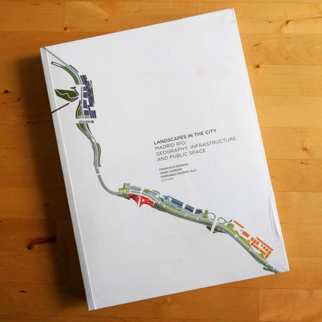
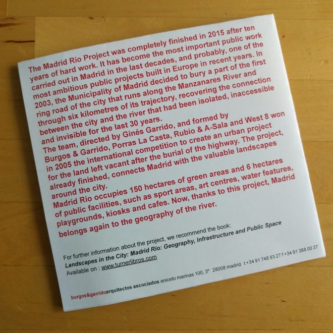
Madrid Rio symbolises massive change, the 156 hectare landscape urbanism project is perhaps the most important, disruptive and most changeful the city has experienced in the past ten years.

Burgos & Garrido, West 8, La Casta Arquitectos and Rubio & Álvarez-Sala won the project through competition in 2005, the ambitious plan launched by Madrid’s mayor Alberto Ruiz-Gallardón. Their submission proposed a solution to the urban problem through a macro social and ecological vision resolved exclusively by means of landscape architecture and urbanism.
IMG_20160523_163010

Symbolic of what can be achieved by an empowered politician, exclusive access to municipal funds, the 4.4 billion euro project was 80% funded by the Madrid municipality and built entirely on council land, unencumbered by protracted land negotiations. Conceived and built over two four year political terms, the project opened in 2013 and was completed 2015, a clear lesson for myopic Australian governance.
IMG_20160523_094517-01

Massive change has brought massive reward, the project has renewed a vast six kilometre tranche of inner city land with a linear park, promenade, bicycle paths, water gardens, playgrounds, small cultural interventions and a renewed relationship between the city and river.

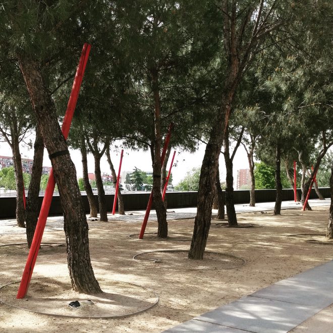
The quality of the landscape is extraordinary, rosemary as mass planting scents the park with a subtle honey combined with crisp pine from the 9,000 pine trees planted in the reserve. The Stone Pines have an ancient character beyond the few short years the park has been open, their irregularities are intentional, the crooked awkward forms were chosen for their agelessness over perfectly straight specimens.
IMG_20160523_163325

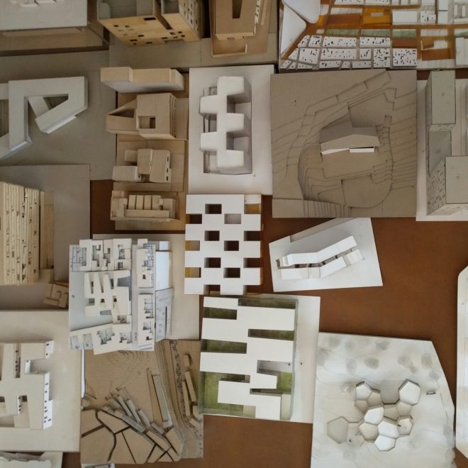
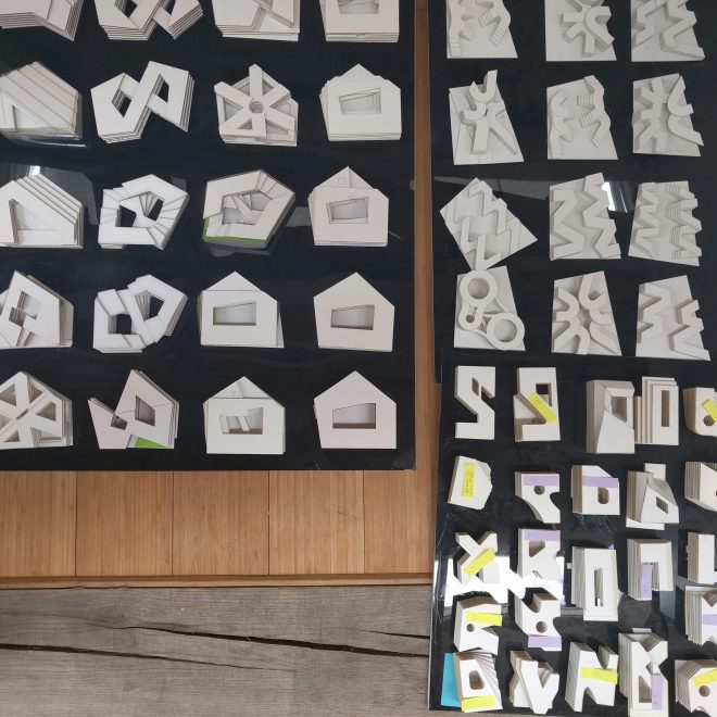
“Models are a part of the way we work.” This line is delivered singularly, emphatically and earnestly to the group at each practice visit in Copenhagen, London and Madrid. It seems that everyone makes models, big models, small models, abstract models and prototypes.


Sketches and diagrams don’t appear any more, whatever happened to drawing? The single authored napkin sketch, the hand of God, isn’t enough. It probably never was, perhaps in their own way these models lend an authority and reality to a project yet to be realised, cemented in reality within an economic climate where nothing is certain.
IMG_20160523_162710

Model making is certainly centred around the identity of what it is to be a credible architect. Miniature dreams, instantaneously realised and transported into the future, authorised by the maquette. It’s a fetish peculiar to Architects, the object rendered in various scales, competition models are wheeled out for inspection like cadavers on display. Their little bodies piled high in dark corners of the studios, evidence of opportunity that can launch a young practice and conversely the burden of time invested in a rat race competitive process. Madrid Rio was won by competition and has propelled the authors into a specialist realm of large scale landscape architecture and urbanism.
IMG_20160523_162744

In retrospect, after a nine days of intense saturation, descriptions of process across the days of practice visits seem homogeneous, conventional and almost universal. Descriptions of process to the group seem to revolve around models and in some cases seem like a deferral from what the practices actually do day to day.
IMG_20160517_173651

Challenging convention are practices like Jan Gehl, an architect who doesn’t build anything, Rogers Stirk Harbour + Partners and Foster + Partners pushing the boundary of technology, similarly Assemble in their own way. These are practices on the edge asitwere, and in different ways challenge architecture practice models however they are in the end tangibly conventional.

The prolific success of Foster + Partners is intriguing, a practice which is conventional in so many ways. Nevertheless a practice on the edge of technology and able to resource it’s own internal laboratory and foundation in Madrid. Fosters are re-imagining and broadening the scope of their service model, a leap made through technology.

Within the attic of the foundation is Foster Lab, the projective vision of the future it seems is still making models. These are didactic, demonstrative and posses an uncanny authority as descriptions of alien systems and improbable ideas. Perhaps models are the future paradigm?

In the end, models are an aside, they are simply representations of ideas and occasionally the embodiment of practices identities. The medium isn’t necessarily the problem, it could be the message. What resonates at F+P and RSH+P is an agenda, these are models which are the embodiment of a manifesto. Formed within practices bent on influencing and changing the construction industry through technology at rapid pace, shifting the pendulum back to the architect as being contributory to the construction industry.

Is this important? It’s pertinent in light of the national AIA conference “How Soon is Now”, where a part of the conversation was dominated by the hand wringing and pearl clutching of a conflicted industry, grappling with its own relevance. These practices are moving forward in familiar and conventional ways by becoming once again the architect as a specialist in architecture as so many have embraced diversification. While this is by no means an answer in total, it’s reassuring someone is looking inward to be projective.

Mathew van Kooy
Day 9: Madrid

The morning begins with everyone taking a Myers Briggs test…never a good start to a Sunday morning. Most people are not surprised by the results but are surprised by the accuracy of the description and continue to let this new found self discovery eat away at them all day. But as our good friend Werner would say ‘you will understand more about this later.’


Werner, our Swiss Germanic Spanish architecture tour guide for the day. Some have described him as a combination of Robert de Niro and Richard Gere with a stroke worthy chest. His love for the city was intertwined with jovial sarcastic comments about the façade driven, and eclectic nature that is, Madrid architecture. He was prepared, but none of us were prepared for the journey he had in store.

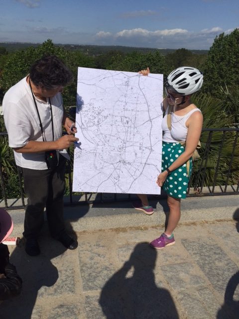
He knew his audience well, I think the architectural mouths started frothing when the A1 cardboard map unfolded and the fat black marker proceeded to draw the topographical situation over the city map.

The mapping begins

The jovial attitude towards the creation of the Spanish capital began early and we very quickly got a sense of the city that didn’t take itself too seriously. After Copenhagen and London it was a welcome relief!


An interesting day for a cycle ride – Barcelona vs. Seville in town that night, Bruce Springsteen the night before. Cycling in Australia you get used to maneuvering around cars, buses, opening delivery van doors and sometimes people. Weaving through the streets and squares of Madrid with throngs of football supporters was another story. Werner did his best to speak over the chanting and music, but I was personally relieved to get a bit of space! With the help of his trusty A1 map sticking out the top of his backpack we managed to navigate our way through the footpath planned city.


While we are here to see architecture, I feel this is not what was important about today. Today was about the architectural and urban story telling that Werner wooed us with – and not just the females. (I will included a list of our schedule below for those who are interested in buildings rather than the finely crafted performance of Werner.)

Through his mapping and inside knowledge Werner painted (drew) a picture of Madrid that we could not have found otherwise. His diagrammatic sketching of the urban sprawl like nature of Madrid over the last 900s years was captivating and not at all obvious to the untrained eye. He pointed out the numerous facades pretending to be buildings and the eclectic roof line made from buildings over a 100 year period.


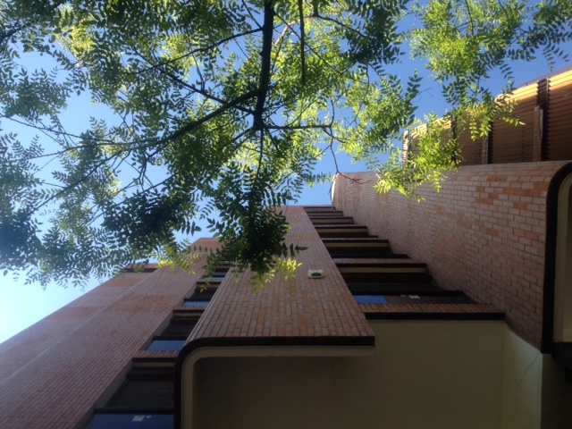
After a plethora of historically, culturally and architecturally significant buildings Werner ends with a beauty.  He had built the day to a perfect crescendo – this wasn’t his first rodeo. The Residential Girasol by Jose Antonio Coderch was appreciated by all. We were surprised to hear that Jose studied under Alvar Aalto in Barcelona, but once we saw the work it became obvious.

Looking up at Residential Girasol

The map is completed and Werner has given us a strong framework to view the city through for the next two days. After almost 9hours of cycling and a mild asthma attack from one member while cycling uphill we end the night with some surprise mocktails (although some opted for the cock option) in the hotel lobby. We slowly let the day flow over us and the building group tensions begin to unfold in moments of instead personal reflection – damn you Myer Briggs!


Despite the erratic development and ‘the crisis’ that everyone refers to in Madrid, Werner puts the success of the city down to the fact that this is not just a city that people come to work or play, this is a city that people come to live! While London is having a continuous flow of money pushed into the development of high rises shaped by the contentious view corridors, people seem in too much of hurry to get to work to really experience what a city of 12million has to offer. Madrid on the other hand has a long history of working within their means, building facades physically and metaphorically. But people continue to flood the streets and public spaces with activity – a Jan Gehl dream as Chris would say. And while money can buy you a lot of things it can’t buy you happiness…or a city that people want to live in.


If you don’t see me back in Australia for a while you’ll know where to find me.


You can find Werner at:

W: http://madrides.es/en/

I: madrides_ga

Please consider him on your next visit to Madrid.

Katy Moir

#duluxstudytour

Day 8: In transit

With our eight day of the tour penciled in as a travel/recovery day, I initially thought the the blog would be a quick one-liner. However, what follows is a brief reflection on leaving London and arriving in Madrid.

We arrive at London Gatwick airport early in the morning to an array of nondescript stainless steel cargo lifts. After checking in we wind through an extended duty-free shopping zone that stocks the typical international chocolate and perfume brands. A crowded atrium divides the food hall from the concourse, which is intersected by two or three gate arteries. We move through the space shifting from digital screen to digital screen. Halfway down the terminal we realise that the windows are, in fact, not windows at all. They are backlit photos of docked aircraft. I board the plane slightly disoriented and regretting that I turned up the 15£ deal on a box set of oversized Toblerone.

The plane sways a little as it hits the ground and I breathe out as it starts to correct and slow to a crawl. Still a little disoriented I exit the aerobridge expecting the low ceilings of Gatwick and instead find myself within a huge volume immersed in natural light. The long views both within and out of the airport allow me to immediately orientate myself. The high, curved and timber-lined ceiling pulls my shoulders back and straightens my posture. This space returns dignity to the traveller. It invites you to stroll rather than walk, it allows you to stop and breathe rather than search and navigate. The building is calm and regular, but light and fun. It uses a colour gradient as a navigation tool and regular structural modules to divide program.

FullSizeRender

This is my church, this is my home. Hats of to Richard Rogers Partnership, a truly phenomenal piece of work.

??

Chris Gilbert, Archier.

Day 7: Assemble, Foster and everything in between

Day 7 and we are past the halfway mark of the  tour. Energy levels have depleted and our ability to absorb anything more has waned. Today we’ve gone from West to East and back again, visiting four practices from Assemble to Foster & Partners. Bundling back onto the Central line tube at peak hour – I’m amazed at how quickly we’ve become used to the routine. Before our first visit we whine for a real coffee (not sure if this is realistic in London) mama-hen Daniela spots a Cafè Nero and pumps us with caffeine. Poor Daniela! She must be so sick of us by now. Hannah comments that she doesn’t know how she’ll cope post tour without Daniela navigating our way across Europe.

First meeting is with Studio Octupi at an office space they’ve designed for ad agency the MULLENLOWE GROUP. There’s always a tension in these corporate creative spaces….this is evidenced in the fitout (plywood wall linings hit expansive grey carpet tiles) to the branding of the space…a safe serif font  with an awkward illustration of an octopus wearing boxing gloves WTF? Ursula, Chris and James take us through a nice presentation of their projects- i feel for them…life as an emerging practice in London sounds tough!!! My idealistic ambitions of starting a SIBLING HQ in the hustle bustle of London are shotdown after hearing about the invited yet unpaid competitions that seem to be the norm. You could be competing against nine others for a commission for a gallery interior to a reception desk. This is a far cry from the paid competitions offered to the larger practices we saw in Copenhagen.

OLYMPUS DIGITAL CAMERA

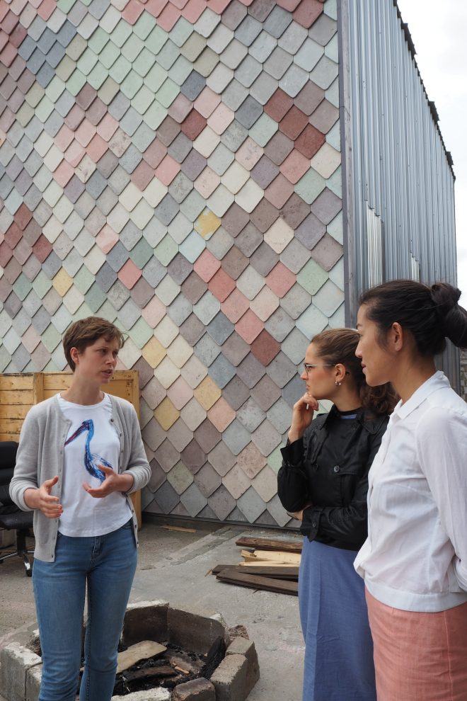
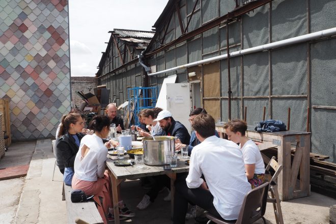
We bundle back on the tube and head further east towards the Sugarhouse studios in Stratford where Assemble hold fort. Finding our way from the tube station is a challenge – we have the studio in sight but can’t seem to find a way across four lanes of traffic to it. When we finally get across we are greeted by the Yardhouse – a two storey timber framed warehouse with studio spaces inside, designed and built by Assemble. Its pitched roof and pastel coloured shingle facade is cartoonish – delightful amongst the repetitive development blocks of the area. The charming Alice greets us and shows us around the studio spaces that Assemble run  and share with other makers, carpenters and metalworkers. There is a sense of calm amongst the chaotic arrangement of spaces. I feel nostalgic being here – the ad-hoc and communal nature of the space reminds me of SIBLING’s beginnings at the Young St warehouse.  Communal lunches served up on an odd collection of crockery and cutlery, a flat hierarchy amongst its 15 partners and an ambiguous situation between art, architecture and social enterprise.

OLYMPUS DIGITAL CAMERA

As Louis from Assemble ladles out a delicious curry stew amongst us, we chat about all sorts of things, arts grants and funding, their day to day lunch rota system, Monday night group design reviews of current projects, and what parties they’ll be going to at the Biennale.

20160520_133303 small

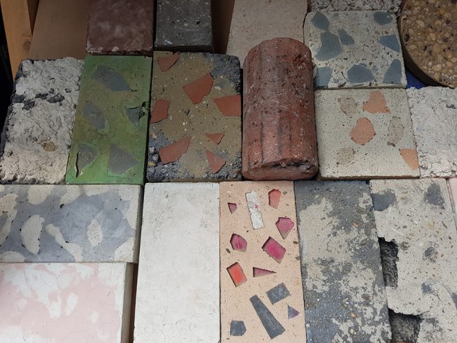
Material tests at Assemble

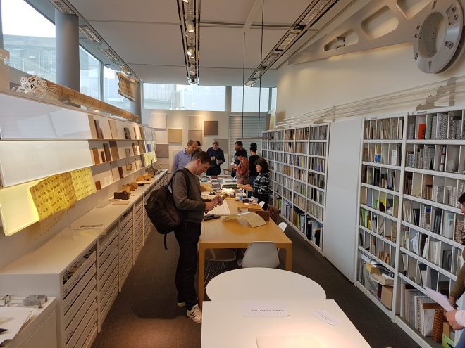
We now head back West toward Foster & Partners, with a stop in Waterloo at Chipperfield’s offices along the way. Entering Chipperfield’s office is like walking into a temple that is about to self combust. We are only shown the meeting space and model making areas – the staff working spaces here are private – much like Chipperfield himself. Rumour has it that the hours here are punishing, but we don’t see any of this, just a collection of beautiful models and a panoramic view over London.

Our grand finale is Foster & Partners, we whizz along the river in our minicabs, Matt is pleased that he’s caught a glimpse of the gigantic Battersea project and takes a snap to prove to Daniela. At Foster and Partners we head straight to the café for a recharge, this place is like a campus along the riverfront. We are met by Ross, whose energy and enthusiasm rubs off on us. He gives us a brief overview of the practice – 1500 staff broken into project teams of 150, different specialist departments and the practices fascination with engineering. We then head around the campus for a tour, while Ross explains their process of design reviews of current projects, within project teams, and higher up between partners. We are blown away by the resources and facilities this place has – a full animation studio and team (there’s even a full time sound producer to create original scores) complete with a sound recording studio for when Norman has to do a voice over; a team of six people dedicated to the Material Research Centre and of course all the staste of the art model making facilities. It seems nothing has been spared, and nothing is outsourced because Fosters will just absorb any necessary skill set or innovation into their company.

20160520_165738small

Material Research Centre at Foster & Partners

Reflecting on everything we’ve seen today – we draw comparisons between Assemble and Foster; the differences in their material libraries and research, how meals are eaten, how they are facilitated and Katy even compares their bathroom experiences. Assemble and Foster are at different ends of the spectrum of architectural practice however both have a collaborative process through their design reviews and both practices are leading in the way they’ve broadened the scope in what architecture can be.

Day 6: Surface Impressions

Day 6 involved a number of practice visits around London to dRMM, Piercy & Company, Zaha Hadid Architects and Wilkinson Eyre.  The common theme that emerged over the course of the day was a preoccupation with the relationship between materials and surface.  Three distinct approaches are discussed below.

IMG_0633

dRMM – Surface as referential

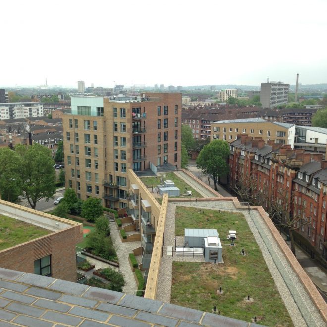
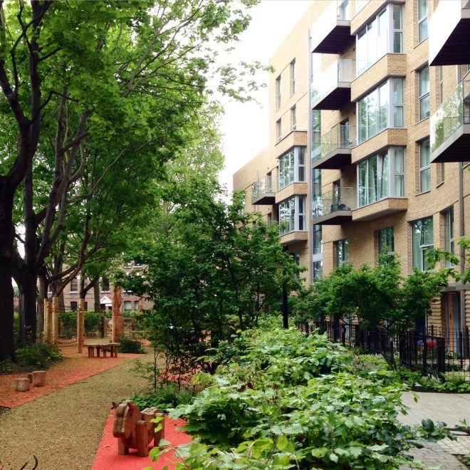
The first project visit was to Trafalgar place, completed in 2015, by dRMM architects.  The affordable housing development is comprised of 235 apartments and replaced a number of 1940-50 modernist buildings.  Located in Elephant and Castle the project is a catalyst in driving the gentrification of North London and significant in its contribution towards tackling London’s existing housing shortage.


The history of the site and its immediate surrounding urban context drove a sympathetic material response which takes cues from the surrounding brick terrace houses and neighbouring Peabody Estate.  Nine different brick colours contribute to the façade and have been selected to match the tones that are existing in the surrounding brick buildings.  This allows for the building to adopt an appropriateness on both an urban and human scale, respecting the place in which it is located.

IMG_0670

Zaha Hadid Architects – Surface as expression

The work of Zaha Hadid Architects adopted a different approach to surface and materiality.  The project work shown was relentless and consistent in its pursuit to challenge formal typologies.  Two Australian projects guided much of the discussion; one multi residential tower in Toowong, Brisbane and one commercial and mixed use tower in Collins Street, Melbourne. Both projects adopt a similar façade treatment whereby the structure is integrated in a decorative woven skin.

IMG_0671

Interestingly, there was a question posed during the discussion which challenged the Toowong project, particularly with reference to the context and place in which it sits.  Unlike dRMM’s approach the trio of tall transparent towers sit in stark opposition to the existing fabric of St Lucia which has a long history of brick and masonry construction.  The question prompted discussion regarding the appropriateness and sensitivity of the built form to its surrounding context.  Indeed, as many large international practices are acquiring work abroad there becomes a need to resolve appropriate site analysis processes that inform positive and appropriate development.

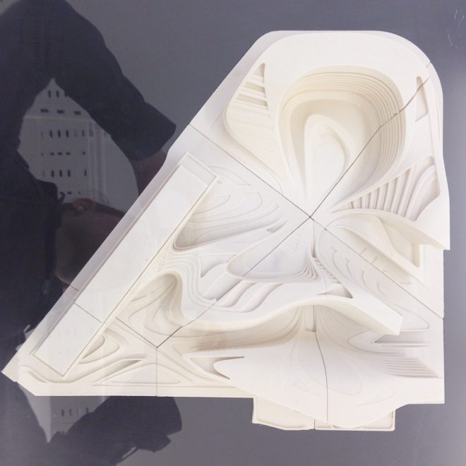
The formal outcomes are very much driven by recent advancements in parametric modelling and software. Rhino and grasshopper are used in the office and become the tools that support this endeavour. The office also has large model making and fabrication workshops that encourage iterative physical testing of complex forms.

IMG_0672


Wikinson Eyre – Surface and Tectonics

The history and evolution of Wilkinson Eyre is rooted in large infrastructure and bridge projects.  This has led to an architectural language that is both honest and expressive of the building tectonics.  In counterpoint to Zaha Hadids approach which typically conceals structure under smooth surfaces, Wilkison Eyre finds beauty in it expression.

Many of their projects were comprised of transparent surfaces which purposefully revealed the mechanics and logic of the building structure.  In comparison to dRMM and Zaha Hadid’s work there is an apparent nakedness to the buildings.  This approach in turn informs the built aesthetic which tells a story of the highly resolved and engineered structural systems.

Additionally, one gains an understanding of how the building works and an appreciation of the structural resolution and efficiency.  Each of the practices visited adopted a very unique and distinct approach to materiality which invariably led to very diverse aesthetic outcomes.

Hannah Slater

Day 5: Walking London, the future was now

Ken Allinson knows London architecture, every part of it. The sixth edition of his book “London’s Contemporary Architecture” catalogues the city intimately. His knowledge of the city and its history is as formidable as his unrelenting pace on the street.


It is a tour that’s dizzying pace that encapsulates the spirit of the city transported within the one mile grid by pounding the street, via the tube, ferries, taxis, rain, less rain and more rain. Icons, classics, mistakes and monstrosities fly past, facts come deftly from Ken at rapid fire on foot. Following in Ken’s wake the tour passes:

The Walkie Talkie / 20 Fenchurch Street (Rafael Viñoly)
London Eye
Jubilee Gardens (West 8)
The White Collar Factory (AHMM)
TEA (AHMM)
The British Museum (Foster)
The Brunswick (Patrick Hodgkinson)
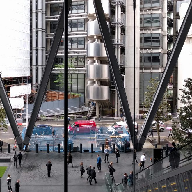
The Leadenhall Building (Rogers Stirk Harbour + Partners)
St Mary Axe (Foster)

Screenshot_20160519-070021-01

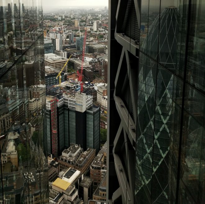
London’s stable of iconic commercial towers is continuously growing in a construction boom. A fine collection of deadly instruments colloquially known as the scalpel, gherkin, the shard, walkie talkie and cheese grater. The latter is the Leadenhall Building by Rogers Stirk Harbour + Partners, a project almost complete and recently occupied by the practice.

IMG_20160518_175126-01-01

In all aspects, the building looks and feels like it was been designed for the future, but a future imagined in the past and a future that hasn’t yet happened and may never. British High Tech is a curious creature of its own, it’s tectonic language codified in the 70s, Richard Rogers is a master of the movement.

Leadenhall adheres relentlessly to High Tech principals: exposed structure, expressed services, slick impervious skin and absolute definition of served and service zones.

It is an extraordinary building in so many ways, spatially rich, visually and organisationally complex and equally pushing the edge of construction technology and systems. Daniel Wright, Associate Partner, explained that the project is over 80% prefabricated requiring unprecedented coordination between contractors and trades. The lifts are a feat of engineering and industrial design excellence, almost completely transparent exhibiting and rarefying each mechanism and elemental part in vivid colour like the back of a Swiss watch.

IMG_20160518_174336-01

These are currently the fastest in Europe, the combined acceleration thrust and transparency is akin to Willy Wonka’s phantasmagorical glass elevator which heroically bursts out of the bleak greyness of the city into the glistening futuristic skyline propelling Charlie into the future.

IMG_20160518_232614

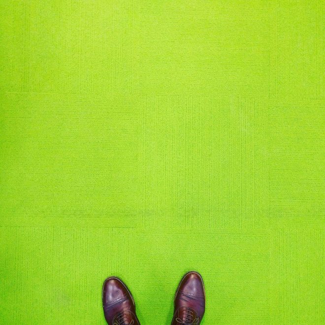
RSH+P occupies the 23rd floor of the building, thier acid green carpet is distinct and jarring after the greyness of London’s streets. Lloyd’s Building completed 1986 by RSH+P fills the view south of thier phosphorescent interior, perhaps in this moment the future imagined by the British High Tech is now.

IMG_20160518_170354-01

Mathew van Kooy
Day 4: Lessons learnt in Copenhagen

Day four marked the study tours final day in Copenhagen and rounded out our time through a series of practice visits.  Each practice visited differed in size, project type and process yielding interesting and diverse conversation.  Five studios were visited, this blog summarises the day through adopting the format of the ‘lessons learnt’ at each practice. The first practice visited was the Bjarke Ingles Group.  Unfortunately, the visit was cut short due to traffic and a late arrival.  The practice shared a number of current projects and discussed the international profile of the office.

Practice 2:  Gehl Architects

The second practice visit was to Gehl Architects where the conversation was focussed around the role of the architect in city makingThe following lessons were learnt:

  1. Architecture does not have to be expensive, in fact it is better if it is inexpensive. Gehl supports the notion of building very simply through ‘glueing’ the architecture on the outside of the building.  He discussed the opportunity for stairs, balconies and trellis’ as elements that serve to enliven buildings and encourage activation
  2. Architecture and advocacy.Architects do not have to build things.  Gehl Architects adopt a role to influence a way of thinking about architecture and drive future change.  The practice advocates the responsibility of architects to ‘plant the seed of opportunity’, which is significant in then empowering communities and encouraging people to take ownership of shaping their own place
  3. Making a neighbourhood and fostering community.Gehl discussed the two most important elements of the built environment as being; the street – which accommodates movement, and the square – which establishes spaces that the eye can oversee.  Together these elements are seen to enliven the urban realm and contribute to lively people places

OLYMPUS DIGITAL CAMERA

Practice 3: Tegnestuen Vandkunsten

The third practice visited was Tegnestuen Vandkunsten who adopted similar principles to those valued by Jan Gehl on a built scale.  The practice aligned with having an urban responsibility beyond the role of the architecture and aim to produce work that ‘gives back to the city’.  This was evident in their work whereby the following lessons were learnt:

  1. Adopting a strong social stance.The practice commits to accepting a variety of work in the office; from social housing to very high end residential.  This is strategic in affording the opportunity to accept pro bono work and drive important research in new affordable housing typologies
  2. Learning from mistakes.Tegnestuen Vandkunsten reflected on moments in built work that in reality did not reflect the original design intent. This was described through a project that was unsuccessful in delivering the urban and public space expectations.  Tegnestuen Vandkunsten discussed frustrations around having the best intentions, but not the foresight to understand how people will use the buildings

IMG_0508

Practice 4: 3XN

The fourth practice visited was 3XN who were strong advocates of the role of research and education in architectural practice.  The following key lessons were learned:

  1. Adopting a research position.It is important to adopt a research agenda that guides the practice.  GXN is an internal research unit that has a significant role in the practice, driving innovation in design work and establishing a competitive edge.  The unit encourages material testing, software development and sustainable technologies in project work
  2. Integration of design research.Despite the presence of GXN the practice discussed frustrations around the design process with research as being first to be ‘value managed’ out of a project.  It is critical to challenge, in a commercial context, the importance of research and innovation to ensure this new thinking is better integrated in the design process
  3. Critical reflection on built work.3XN identified post occupancy evaluation and the practice of measuring the success of built work as being critical in ensuring the ongoing growth and development of the practice
  4. The role of the Institute.Denmark’s Union for architects is a precedent for fair work and salary to modelled off. Equitable pay is enforced and valued through the union which protects and dissolves gender pay gaps

OLYMPUS DIGITAL CAMERA

The final practice visit was to Lundgaard and Tranberg where a conversation around process and office culture ensued.  The following key lessons were learned through the conversations:

  1. Encouraging universal input fosters better design.It is important that everyone in the office feels they have the opportunity and confidence to contribute to the project outcome and have a voice in the office.  Ultimately this approach fosters more rigorous design outcomes
  2. Competition work driving innovation.In Denmark 85% of work in the office is competition work (compared to approximately 20% in Australia).  Lundgaard and Tranberg adopt a healthy stance towards competitions with a view that they are critical in encouraging innovation and creative thinking, pushing the design response beyond the norm
  3. Potency of the design diagram and intent.Lene Tranberg discussed the important role of storytelling in the design process.  She identified it as critical in ensuring the entire team; client, consultants, builders and staff, are brought on the journey to ensure the delivery of a fulfilling outcome

OLYMPUS DIGITAL CAMERA

It was a privilege to have been given the opportunity to visit and engage in direct dialogue with such a diverse number of Danish practices.  The most significant personal learning from the day can be best summarised though a statement by Jan Gehl who posed the question; ‘What does it take to be a good architect? If you want to be a good architect you must love people.  Architecture is not about physical things, it is about constructing a framework for life…’ Indeed, this sentiment was evident across the work of the five practices visited and realised in a diverse number of in a number of different ways.

OLYMPUS DIGITAL CAMERA

Hannah Slater

Day 3: Tillbaka till Framtiden

5:30 am Copenhagen (Public Holiday)

Waking up slightly confused as to what time of day it was and where I was, I head out the door to gain my bearings and experience the city at its quietest moment. I head east towards the old city centre and am struck by how inviting the narrow, vacant streets appear. For over an hour, I wander the streets salivating over brick details and fluid forms created by the tiled roofs.

FullSizeRender2

8:00 am Superkilen by BIG

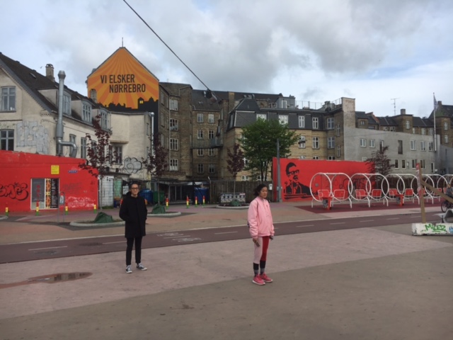
Qianyi suggests a quick trip to BIG’s Superkilen. After a short bus trip we arrive at a large, empty red square scattered with concrete bollards and decaying public furniture. The harsh Scandinavian winters have taken their toll on the once brightly coloured public intervention. A little disheartened, we continue along the long park which quickly changes mood – morphing from a large, exposed site into a playful artificial hill. Within moments, we are joined by two young boys on scooters immediately put the space to use. They race up the hill, swerving in and out of the painted laneways. Our initial scepticism of the success of the process recesses as boys once again race to the top of the hill and line up for another run.


IMG_1567

11:00 am Henning Larsen Architects practice visit

Amalia Gonzales generously takes time out of her public holiday to show the group around Henning Larsen Architects. The office of over 200 architects works predominately in the cultural and educational realm and has recently attempted to distinguish itself by establishing a large environmental research and development arm. The specialized sustainability team contains engineers, architects and PHD researchers. The team has managed to create a large urban scale microclimate that is 7 degrees cooler then surrounding environment for a 3 million squaremeter financial district in Saudi Arabia.

OLYMPUS DIGITAL CAMERA

3:00 pm Across the bridge to Malmö

We are greeted in Sweden by passport control and sniffer dogs, it appears that the passport free zone has been recoiled.

3:30 pm BO01 housing development site visit

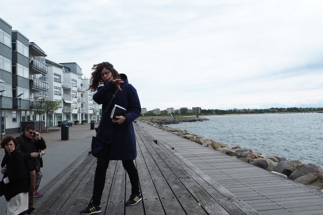
It has been almost 10 years since I last visited Malmö and the city feels completely different. Now fresh and energetic, the city appears to have made the successful transition from a labour to knowledge and real-estate based economy. Part of that success we are told is due to the BO01 waterfront housing development. Eva from Jan Gehl’s office, who work on the original masterplan and who is now a resident, generously offered to show us around the former port. Putting aside Calatrava’s phallic twisting torso towerm the contrast between the yesterday’ss experience of Copenhagen’s Ørestad could not be more dramatic.

FullSizeRender

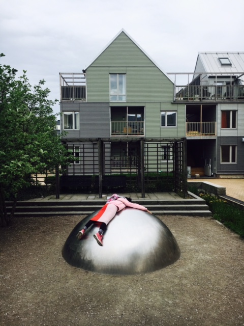
At BO01, the traditional large plot development has been dissolved into finegrain row house typology with larger buildings located strategically to create windbreaks. The rigid grid has been broken, resulting in a range of sheltered courtyard spaces. As we walk through the development, kids play in the streets, people garden and service crews go about their work.

OLYMPUS DIGITAL CAMERA

4:00 pm Malmö Eastern Cemetery

A quick run around the Malmö Eastern Cemetery stuns us all. The design shifts the traditionally morbid landscape from a public utility to civic amenity.

OLYMPUS DIGITAL CAMERA

4:30 pm World Maritime University by Terroir + Kim Utzon

The Australian project architect meets us on site for a guided tour of the new addition to the World Maritina University. The new foyer sits at the intersection of the city grid and the old port responding to the shifted axis with a folded facade. The addition allows occupants to view and engage with the existing building in ways rarely afforded to a pedestrian.

OLYMPUS DIGITAL CAMERA

6:30 Dinner in Malmö

One of the best meals of the trip! Thanks Dulux.

Chris Gilbert, Archier