Day 2: Mainly BIG

The conversation around the development and progression of housing in Copenhagen began for me with some locals I had met earlier in the week. They described ongoing concerns with the affordability and the huge disparities that exist between the culture and fine grain activity that occurs in an existing suburb like Norrebro and the creation of culture and community that is being attempted in the relatively new development of Orestad.
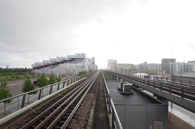
Orestad: the desolate wind tunnel

Many of us have seen successful examples of the former, but are still struggling to experience and achieve successes in the latter. We all went in with different expectations, some were excited, some were reserved, some expected the worst. A few members of the group had been taken over by the jet lag the night before and gone to bed relatively early, others had pushed through and some(one) tried to ignore that their jet lag even existed. All looking fairly spritely and ready to hit the ground running, but whether that would last would remain to be seen.

Our Spanish tour guide (and architect), Vicente was able to present us with very honest opinions about the development of Copenhagen, not impaired by the Danish responsibility and pride. He explained that the nature reserve on which Orestad stands was unpopularly sold by the government to help pay for the metro. The soil from the metro excavation was then being used to build up Nordhavnen, Sydhavn – affectionately known by locals as the ‘white ghetto’ – and other pockets of land in the water. Dubai in Copenhagen?

Our first stop was the Tietgen Student Housing by Lundgaard & Tranberg where a college resident was our tour guide – a particularly beneficial experience. As architects we often engage in conversations about our concepts, the development of ideas and construction methodologies. Rarely are we given the opportunity to discuss the results and outcomes for the user. The tour guide was a student of musicology and history, and his knowledge of the building reaffirmed how engrained design is in the culture of Copenhagen. He spoke about many positive aspects of the design; the circular form allowing for protection from the wind, surveillance of parties across the courtyard and the ability to find some sun at any part of the day.
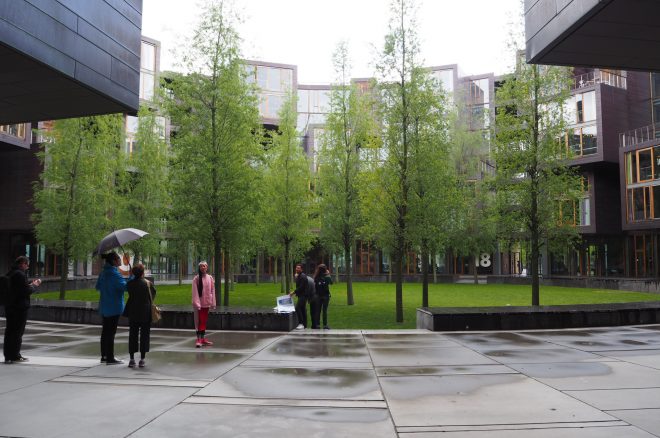
Tietgen Student Housing

Our student tour guide had some criticism to offer – good lessons for emerging architects. The concrete floor that can’t withstand any liquid means that spilling is just not an option. The chairs that continually break and are uncomfortable. Despite this, the architects insist that these chairs must remain as the communal area furniture. Breakages and continual maintenance don’t phase the building owners who want to be seen as a continuing to support this facility.
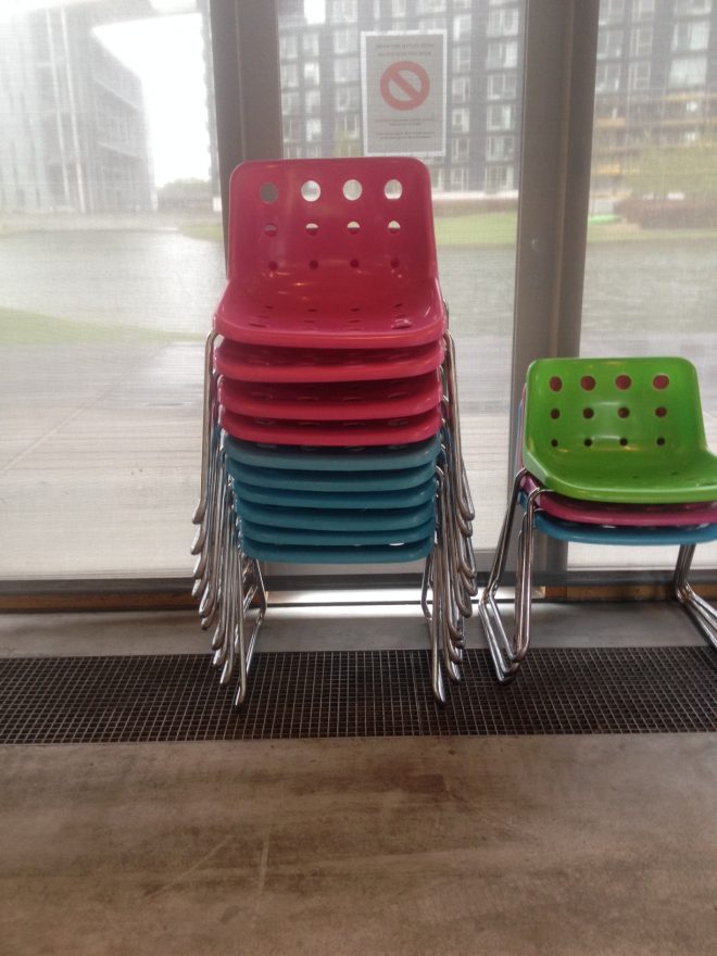
The uncomfortable chairs

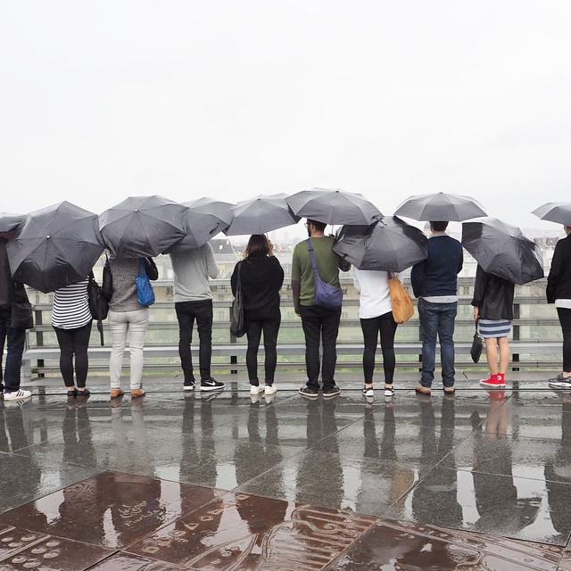
We continued through the desolate wind tunnel of Orestad to 8-House, VM Housing and VM Mountain Housing. The one thing that struck us all was the great sparseness and lack of activity that exists in between and around these buildings. For a city that was used to create a book about life between buildings, these lessons seem to have been forgotten in Orestad.
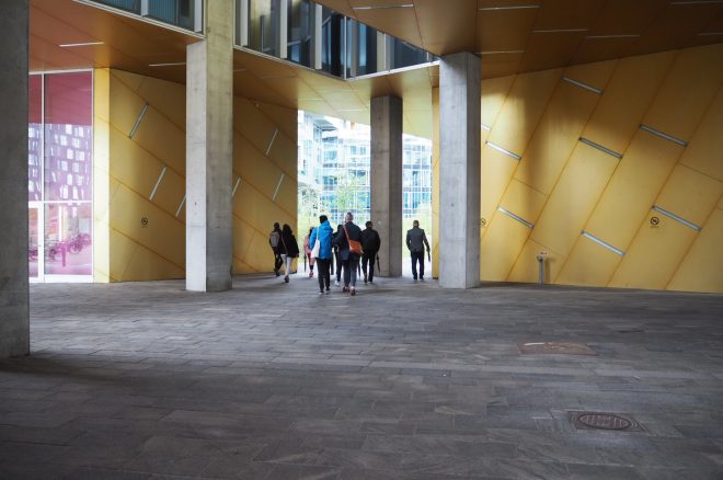
VM Mountain Housing entry/carpark

When these buildings are presented to us we are shown beautiful diagrams and ideas about housing that challenge the norm and challenge the clients that are funding them. And while the success of these buildings individually may be strong, the place in which they are positioned and how they relate to one another completely detracts one’s attention from the innovative ideas of the architecture.

Vicente made comment that so many of these projects are about public relations, not people. This explains the huge struggle that these developments are having in attracting and retaining people. No one wants to set up business there because no one lives there, and no one lives there because there aren’t enough facilities to support a population. As Jan Gehl wrote when people are stimulated by people, a self-reinforcing process can begin.
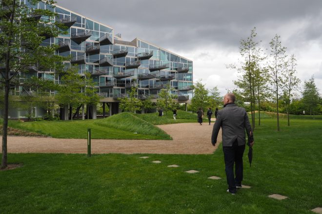
VM Housing

The visit to Orestad raised a lot of mixed feelings within the group, but I think the one thing we should take from this is solace. Solace in the fact that even a city like Copenhagen, which is put on a pedestal of successful urban design, faces the same issues that we are all facing on the opposite side of the world. I think there is a valuable lesson to be learnt in that while we can look outside Australia for guidance of successful architecture we can also learn from others mistakes. We are reminded to always question what is put in front of us because even an architect can be a successful salesman. In saying that, how does one begin to create an active and social community from nothing without first selling an idea? We can’t expect to breathe the life and activity of a city into a nature reserve overnight. Does the development merely need time to gain momentum and life? The ideas suggest yes, the tapestry of “SOLD” signs suggest otherwise.
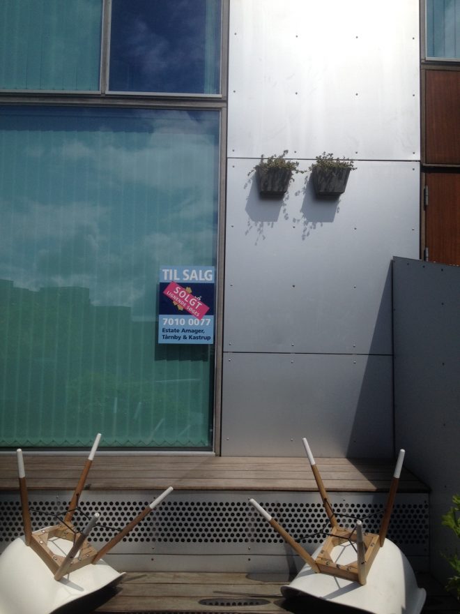
Sold - 8 House

Katy Moir
 

#2016DuluxStudyTour

Day 1: Planes, churches and birds

We left Melbourne on the most beautiful autumnal day, off into the anywhere of airports, taxis and planes. We’ve arrived in Copenhagen. No one has lost their bags and we have managed leave the airport quickly. Our taxi has taken us to the wrong hotel, ordinarily this wouldn’t be a problem. However, our itinerary is back to back and the first project visit is within two hours of landing and closes at 4pm promptly, it is a church after all.
Eventually we arrive at the hotel with 15 mins to spare, hurriedly most of us check in before another taxi is booked to take us to the Bagsvaerd Church. The taxis are already at the hotel as we disembark the first. This is no doubt a perfect opportunity to order nine different coffees in the hotel foyer. The taxis can wait, after a 21 hour flight simple pleasures seem important and coffee is essential (a shower would also be good).

Nevertheless, everyone is buoyant after their coffee and we scrape together our collective knowledge on everything related to Jorn Utzon in order to be somewhat prepared to meet Jan Utzon at the Church. Our ability to gather critical facts is somewhat impaired by the onset of jet lag, the effect of the coffee isn’t working as well as some of us hoped.

OLYMPUS DIGITAL CAMERA

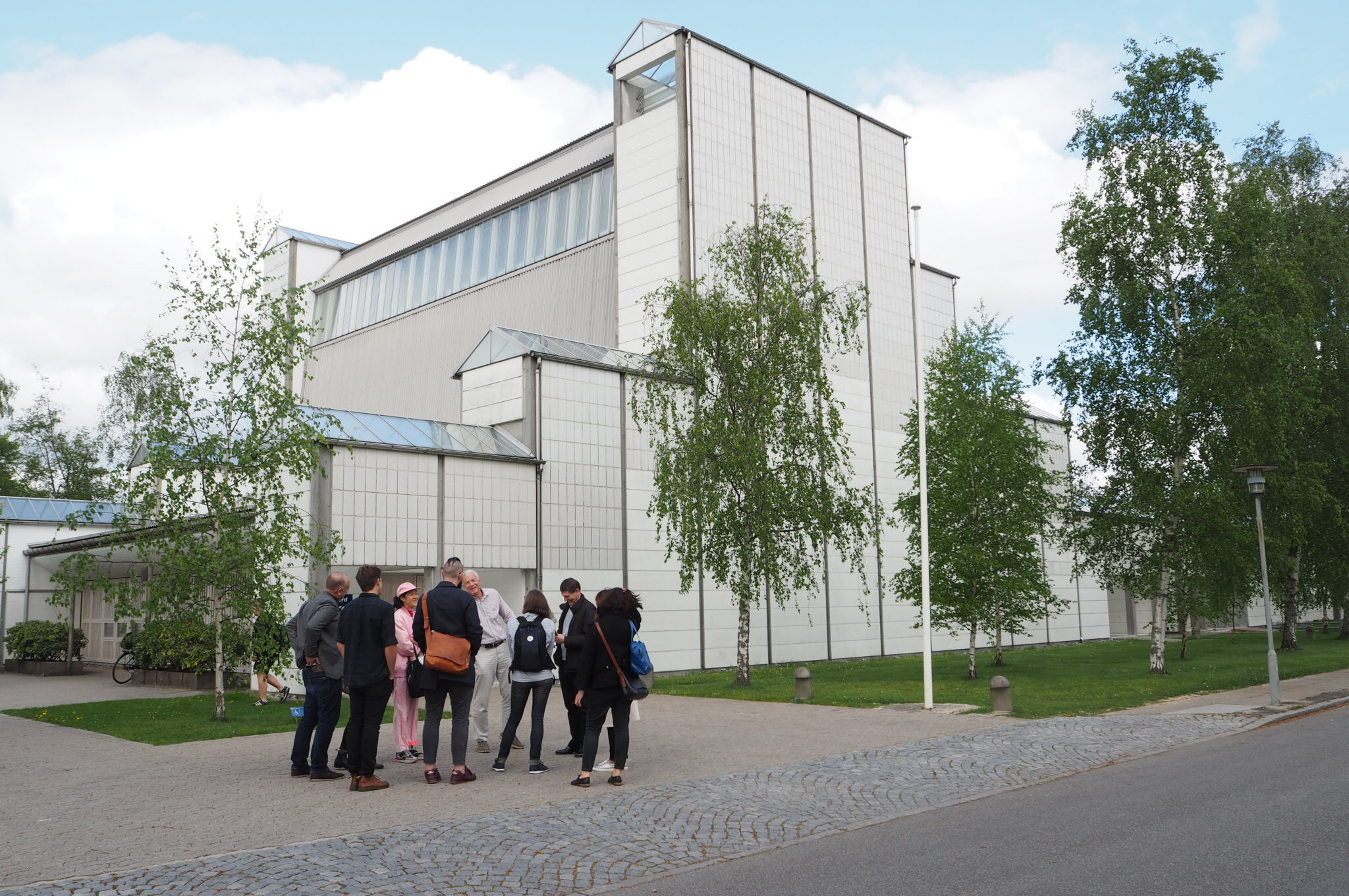
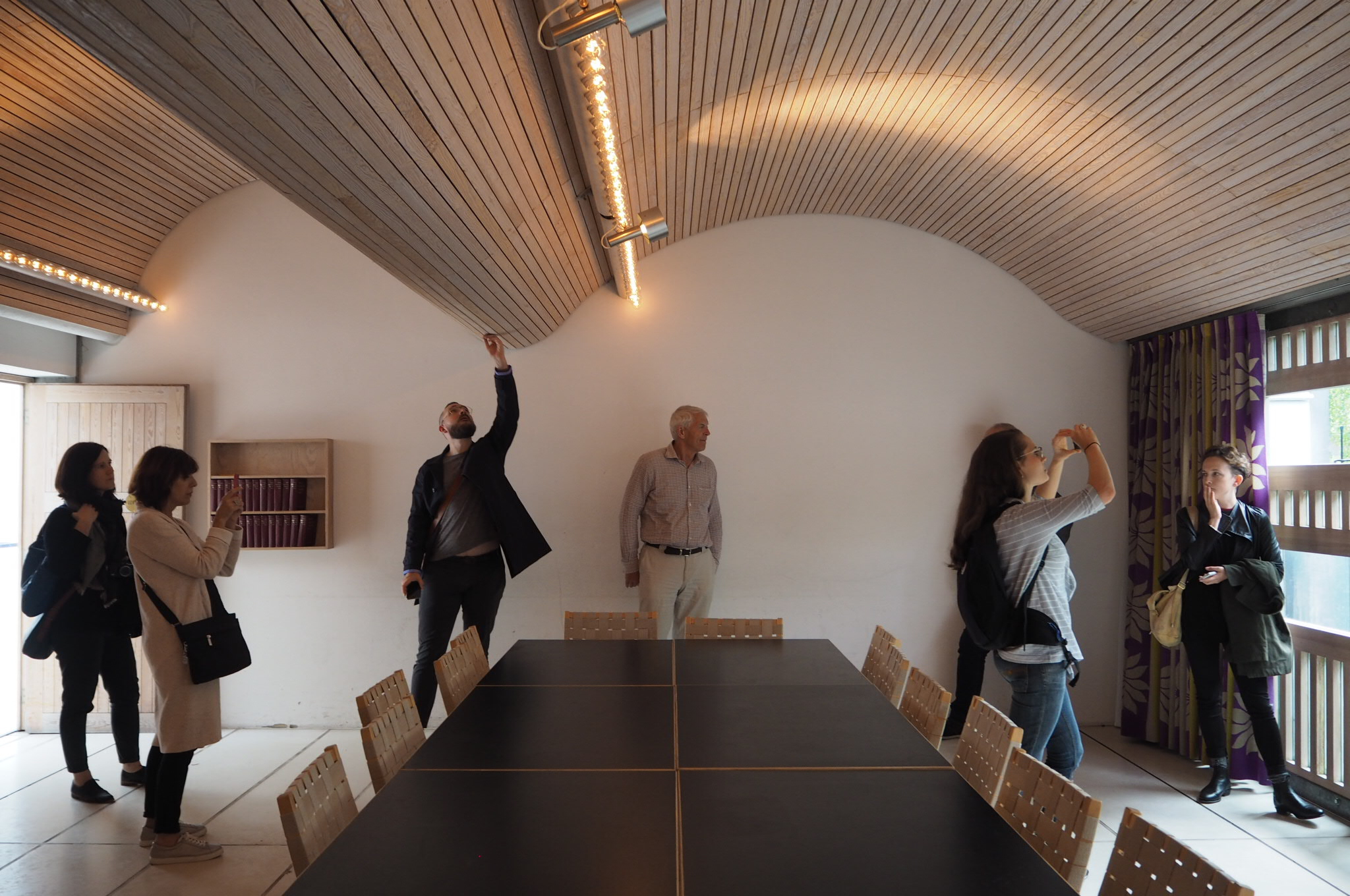
Bagsvaerd Church is in a quiet suburb and there is no one in sight as we topple out of the taxis, we are however on time. Jan Utzon emerges from the small white washed pine door to greet us. Jan ushers our group into the first vestibule and gracefully describes the building, its materiality, construction methodology, detail and history. Jan talks effortlessly about a project that he knows intimately, he made the first model in his fathers office during his final year studying and took over the project management soon after. Having been involved with the project for so long he has wonderful storeys about about the day to day and changes that have occurred over time. He recalls a few years ago the interior was repainted and the painter proudly showing him the fine work he had done painting all of the raw exposed steel handrails, this wasn’t meant to be and the poor man spent a month stripping back the paint. The hand rails are exquisite and still retain their patina unaffected by the small mishap.

OLYMPUS DIGITAL CAMERA

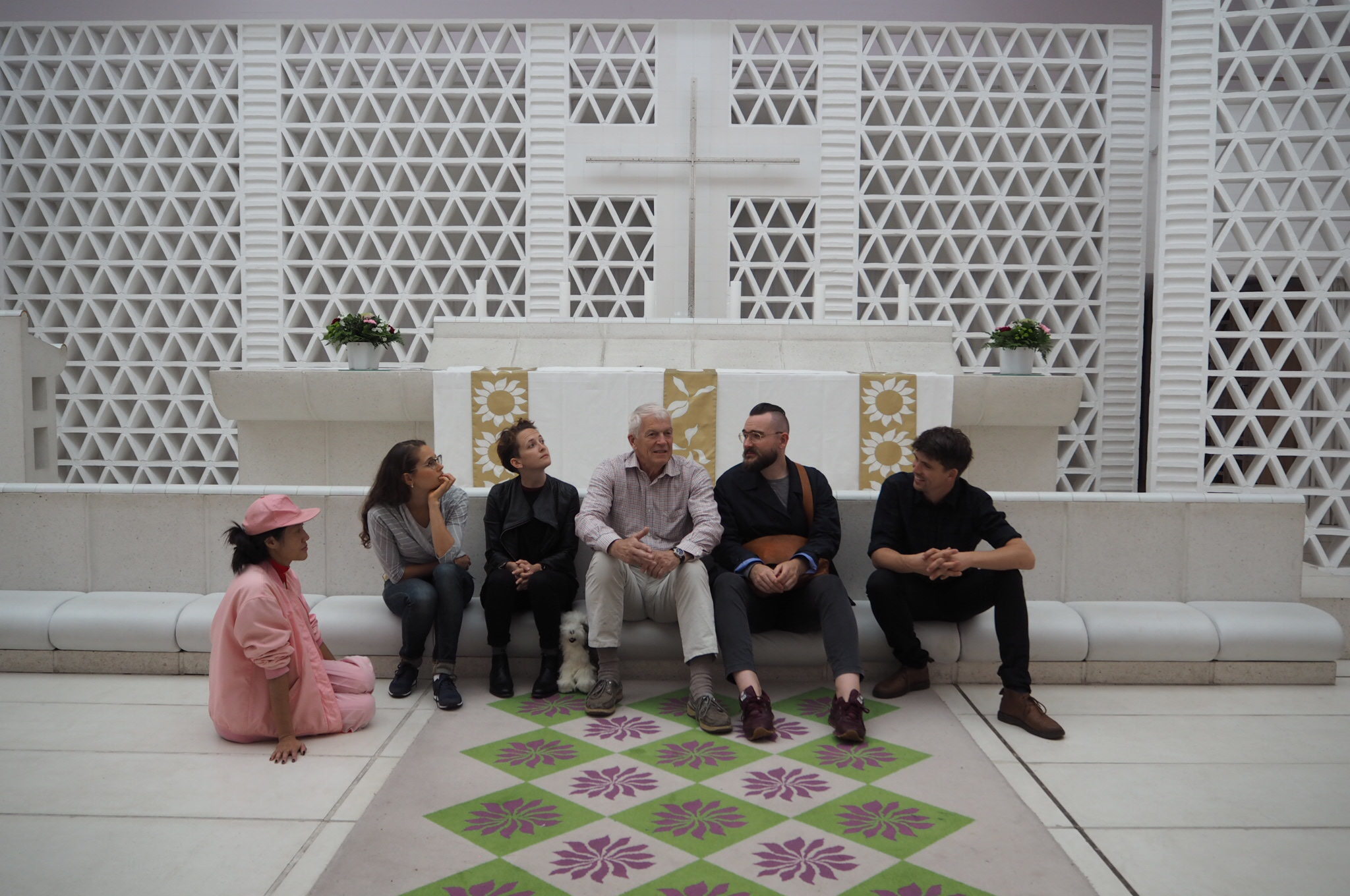
It’s a project that was holistically designed by the architects including the furntiutre and textiles, there are stories about these as well but that might have to wait for another time. I asked Jan where the bells came from, bells are interesting objects and often have their own history. These were made in a foundry in Denmark as was every part of the building, some of the makers still work with Utzon to repair items designed for the church. The white patterned carpet was remade by the same weavers and looms a few years ago.

OLYMPUS DIGITAL CAMERA

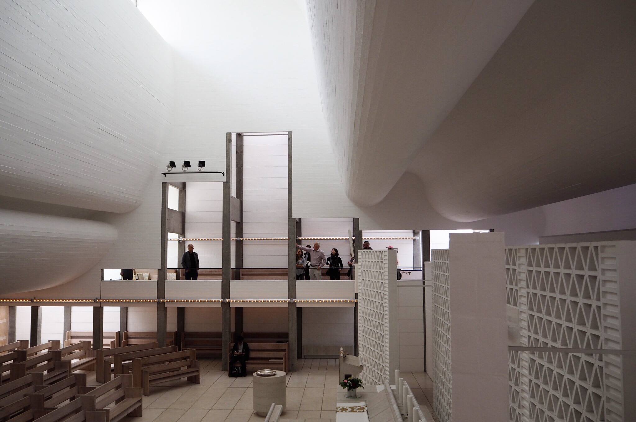
The quality of light brought into the space through the improbably thin concrete shell roof is extraordinary. While we all know the project interior, most of us have never seen the exterior of the building, it is surprisingly blank and defensive and predicted the widening of a road which never eventuated. The predominantly blank masonry perimeter is composed of matte pre cast concrete and gloss enamel tiles which reflect the interior undulations of the shell roof in an abstract pattern.

OLYMPUS DIGITAL CAMERA

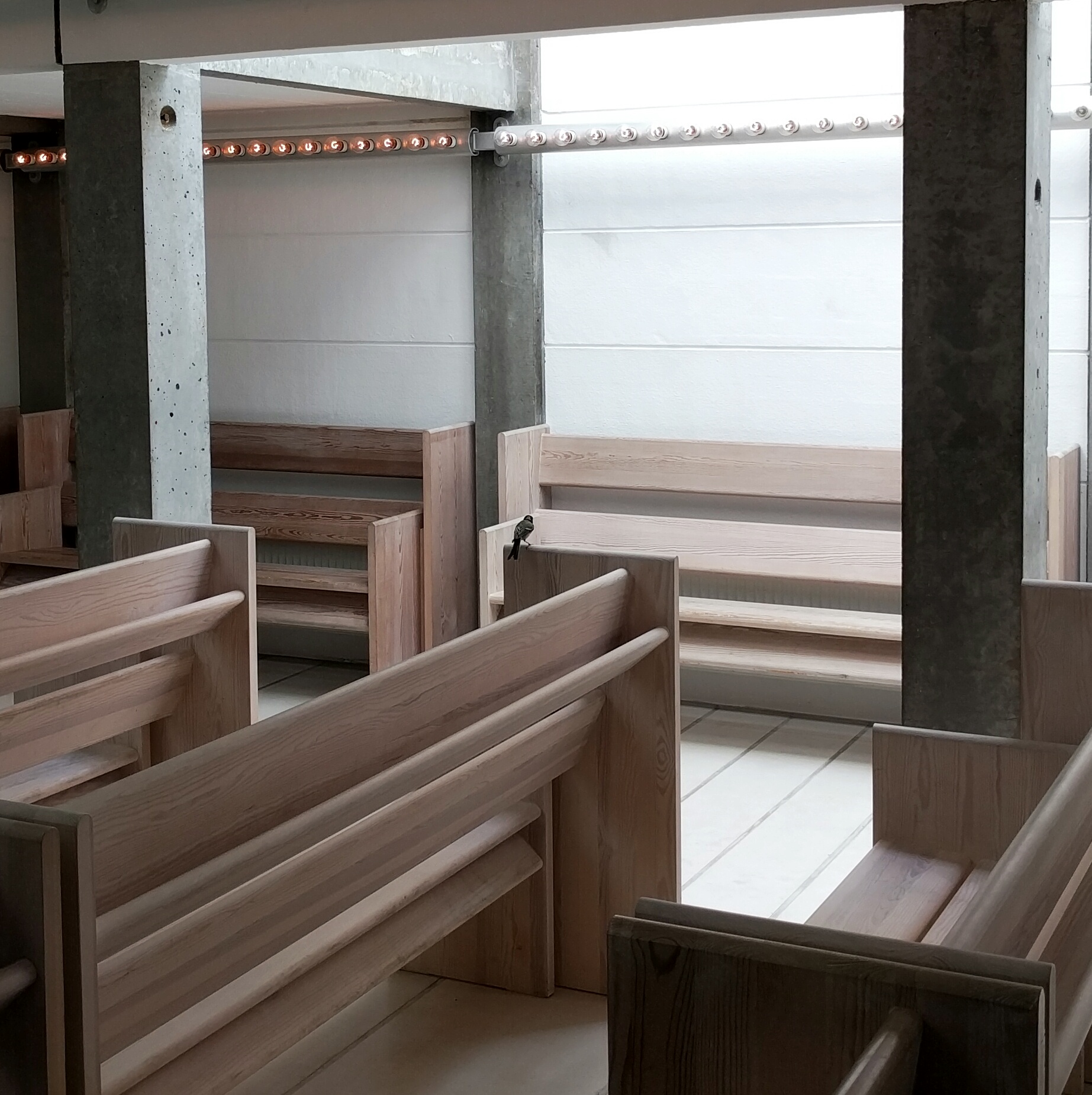
Some of us heard a quiet scuttling behind a box of cushions within the main chamber, there was a small bird trapped between the wall and box. We move the box and the bird, a little dazed, settled on one of the pews and fills the space with a short song that resonates through the space.

IMG_20160514_151815-01

Weary, we bundle back into taxis and return to the hotel. Everyone retreats to their rooms for well deserved showers. Over dinner jet lag settles in and our conversation skills deteriorate, between one another this seems to work sufficiently.

A few stragglers spend what’s left of the evening in the hotel foyer making confused conversation with our friends we’ve convinced to meet us. We’ve come so far after all.

Mathew van Kooy

#2016DuluxStudyTour

2016 Dulux Study Tour Competition – Now Closed

The is your final opportunity to be part of an exciting and coveted program that inspires and fosters Australia’s next generation of emerging architectural talent – the 2016 Dulux Study Tour.

Winners will embark on an exciting architectural tour of Istanbul, London and Madrid where they can experience firsthand some of the best architectural sites and practices.

Simply click here to enter.

Entry into the 2016 Dulux Study Tour is a two stage process:

Stage 1
To enter, entrants are required to submit their answers to four nominated questions, their contact details and details of their employer via the online entry system.

Stage 1 submissions must be lodged by no later than AEST 4pm Thursday 17 September 2015.

Late submissions will not be accepted. Entrants’ answers to the nominated questions will be judged, and shortlisted entrants will be notified to enter into Stage 2.

Stage 2
Shortlisted entrants must upload via the online entry system an A4 document that includes; one written employer reference, resume (maximum two pages), portfolio of works (maximum of four pages). Submissions for stage 2 will be open from Wednesday 14 October 2015 when shortlisted entries will be notified of outcome. The closing date for Round 2 is 4.00pm AEDT Thursday 5 November 2015.

2016 Dulux Study Tour Terms and Conditions

Process Event: Drive

Process in Melbourne kick starts the 2015 post tour talks…
When: 6.30pm, Monday 6 July
Where: Loop Bar, 23 Meyers Place, Melbourne 3000
Speakers: Bonnie Herring, Monique Woodward and Mel Bright

What drives the best of us?
Awards recognise a person’s achievements and celebrates the output of their careers. With that comes a lot of hard work in the interim, though these don’t often take centre stage. Everyone has their own drivers – the motivations, inspirations, and influences which keep us going in some form or other. This month, PROCESS brings together three Victorian architects who have been recognised through this year’s Dulux Study Tour Award and Emerging Architect Prize. The event will delve into the things behind the scenes, and discuss projects, reflections, and projections.
Join us on July 6th to talk to these amazing ladies who are driving their careers sky high.

1507-PROCESS_DRIVE

Day 9: Paris building

The last day of the 2015 Dulux Study Tour was upon us and I was already becoming nostalgic about its ending. Having spent more than fifteen hours together for the last eight tour and travel days, there was a fear of moving on from the carefully orchestrated Amazing (archi-)Race. Fear of being left to our own devices and that creeping feeling of ‘has this all been a dream?’

Jean Nouvel

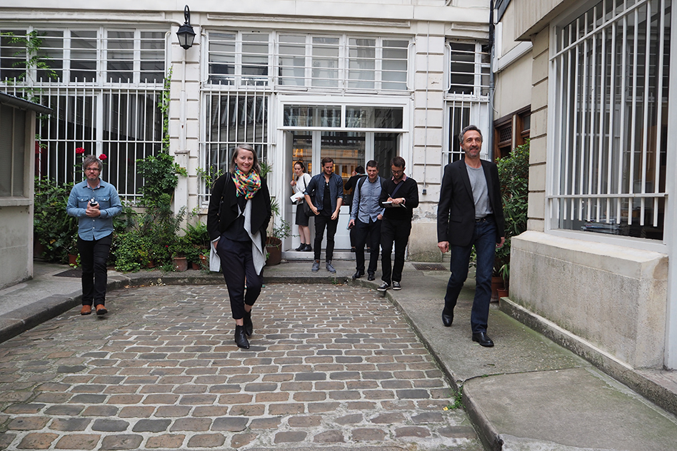
Fuelled by croissants and caffeine, we travelled to the office compound of Ateliers Jean Nouvel that had over the last fifteen years, gradually occupied a series of adjoining buildings wrapped around a paved and pot planted courtyard. Following our visit to the politically embattled Philharmonie de Paris on the edge of the Parc de la Villette the evening before, we were very conscious of the elephant in the room. Jean Nouvel’s ‘Ambassador’ Manuel filled us in on the financial political, scheduling and legal fall out of a project turned sour. Certainly at that scale it is hard for any of us to fathom.

Jean Nouvel

Shifting to other points of discussion, we were surprised to receive a rather candid assessment of the practice evolution. It had become a pattern for the women architects to stick around, while their male counterparts had a tendency for itchy feet, many moving to start their own practices after learning the ropes. Though in Manuel’s case and for several others too, there was also a tendency to return once work became scarce or when they were willing to concede their design autonomy to the starchitect.

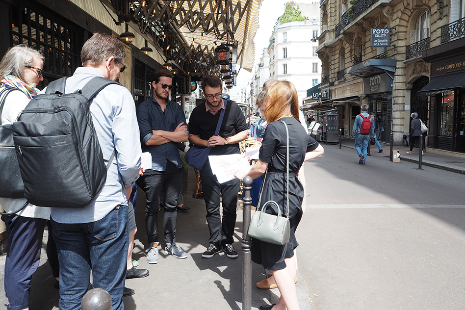
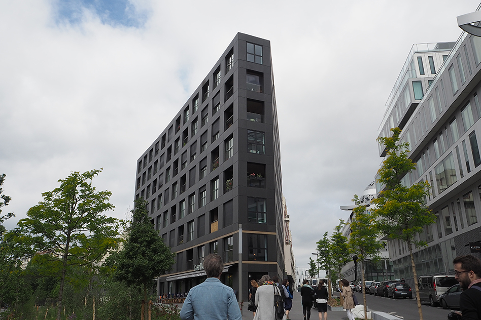
Next we visited LAN’s mixed use Homage to Haussmann in the 17th Arridosment. We were taken through cute pedestrianised streets lined with charcuterie, fresh produce and cafes that had us hankering for our next baguette fix.

LAN Architecture

Wedged between defunct rail infrastructure now being developed and an area of the traditional and iconic Haussmann housing with their hierarchical street walls, LAN borrowed from the desirable latter typology to design an adaptable apartment/office floor plate with externally load bearing and prefabricated facade that hinted little toward the primary residential use.

Renzo Piano

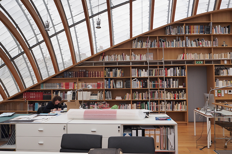
We made tracks to Renzo Piano’s recently completed Fondation Jerome Seydoux Pathe in the 13th where we were suitably impressed. The ‘little casper’ or silver ‘armidillo’ glazed bubble quietly rose up above the slate and zinc rooftops behind adjoining heritage facades, and was the first blobitecture we’d encountered on this trip. Surprisingly perhaps, we all immediately felt cocooned within its bow of curved timber ribs and perforated aluminium shingles. The project architect, Torsten, ran us through its sophisticated yet user operated ventilation system while we fought the urge to fall asleep in the womb like structure.

Renzo Piano

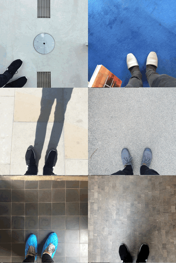
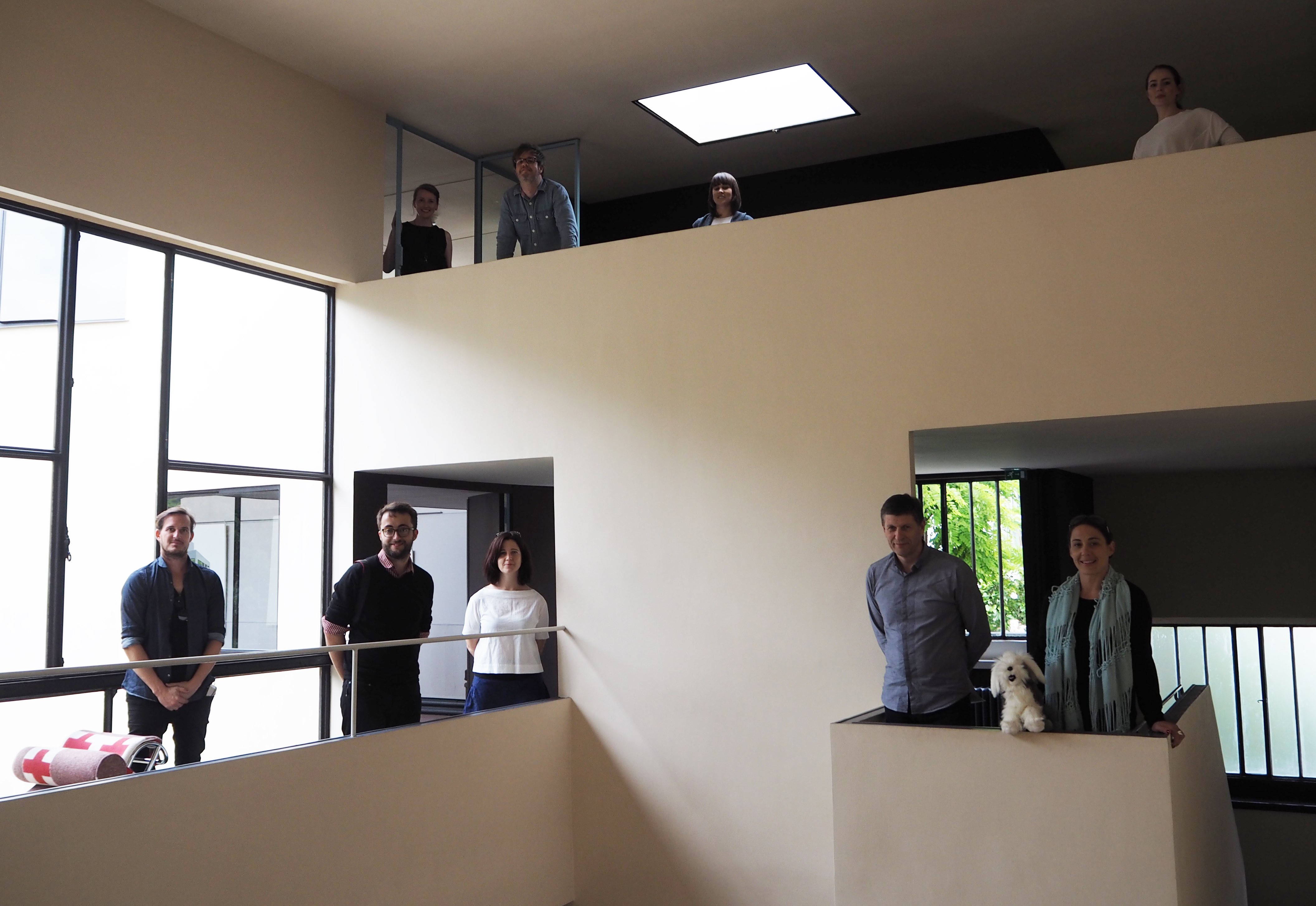
With some spontaneous hustle, we took the train to the 16th to the Fondation Le Corbusier at Maison la Roche for a speedy hit of Modernism before our final visit of the Dulux Study Tour. In disposable blue shoe covers we darted up and down the three stories ooh-ing and ahh-ing at the excessive circulation, modestly proportioned rooms and novelty of being able to track each other from almost anywhere in the building.

Maison La Roche

Content with our Corbusian diversion, we settled in at the Ordre des Architects to discuss the architectural scene in Paris over a beer, debating differences between established and aged starchitects (“who’s ego forbids them to retire”), and the smaller more collaborative studios that are still suffering from the 2009 economic downturn.

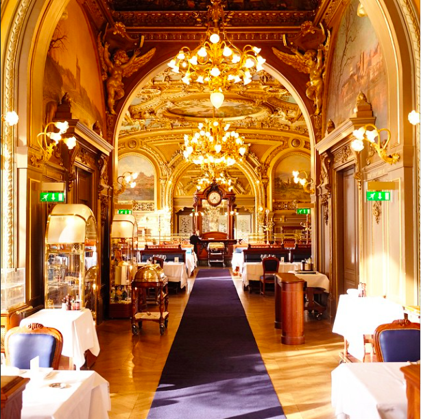
Lastly, from the austere modern of the Maison la Roche and stripped-back former convent home of The Ordre, we came to the distinctly Parisian, Train le Blieu that radiated grandeur and opulence. While we watched our dashingly dressed waiters and frescoed surrounds we reflected on some of the highlights: Fuji Kindergarten, Barbican, Fondation Jerome Seydoux Pathe, meeting with Astrid Klien and Kevin Carmody, and lowlights: bag snatchers in Paris, lack of sleep and plane food.

Never a dull moment on this premium trip. Thank you Dulux, AIA, AM and my exceptional archi peers, you’ve been an absolute delight.

#2015DuluxStudyTour

– Bonnie Herring

Day 8: Paris practice (and parks)

Yesterday’s architectural tour of the outskirts of Paris left us with many questions about the mode of architectural practice in this city. First we enjoyed a long breakfast-cum-brunch at the opulent hotel buffet to prepare for a day of practice visits. We hoped to find answers. How did the 1980s building boom get so crazy? How does social housing really work in Paris? How does carrying a baguette make you look so damn cool?

AS.Architecture-Studio practice visit

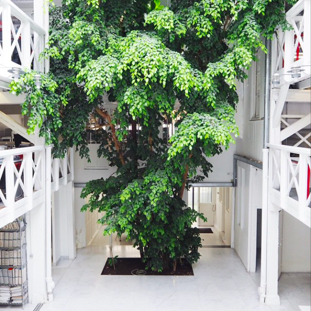
Our first stop was AS.Architecture-Studio. All our questions melted away as we were seduced by the stunning renovation to the rear garden of a Parisian mansion. Behind a docile Haussmann elevation, an indoor tree sprouts from white marble floors, climbing up the traditional white timber framing, amongst staff sitting all around on three floors of mezzanine, to the glass roof above. Deeper into the office and across a courtyard we find a modern extension to the office, matching with tree, glass roof and mezzanine, differing through the use of steel and vinyl instead of timber. Deeper still and we are toured through the practice’s extensive history, displayed in model format in a brick vaulted basement. The stunning offices beside, the work of this international practice inspired questions of Paris’s historic values, over that of a blank canvas like China. Does a practice need to just divert its workflow towards foreign projects in order to get the freedom to design their ideal buildings? We left with no doubt of the quality and innovation of this practice and admired their ability to retain these values at the largest scale of architecture.

2015 DST crew

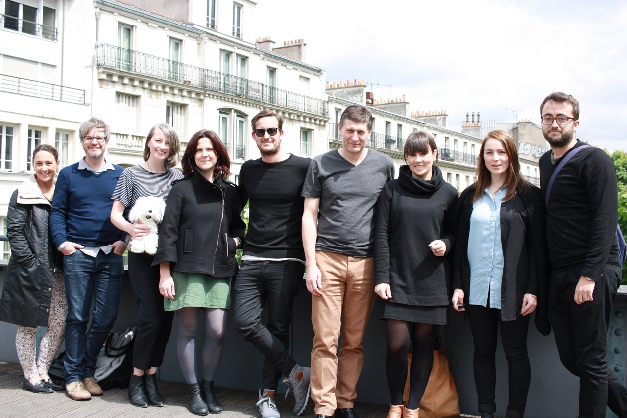
Upon departing AS.Architecture-Studio we treated ourselves to a short walk around the historic Marais district. Our first discovery, although not confirmed, seemed to be a perfect candidate for the role of prequel to New York’s Highline park. This elevated Parisian garden gave a new outlook on the surrounding buildings. The lushly gardened strip of about 4.5 km was frequented by runners and locals, and was a great insight into the city’s productive use of disused infrastructure. It also provided an idealistic backdrop for some Instagram-worthy group photos.

Place des Vosges

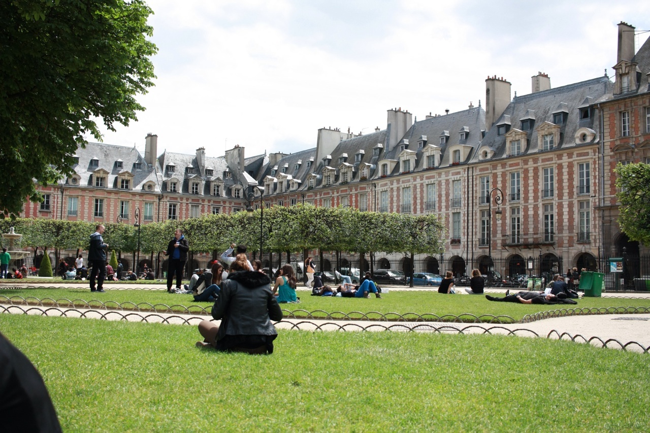
Further into the Marais and we picnicked at the Place des Vosges. The first planned square in Paris (and apparently Europe), the 140 m x 140 m grand square was bustling with locals. With our three-course breakfast still digesting, we tucked into some fresh baguettes. Eating and relaxing all day – how very French! The Place des Vosges was a refreshing change from modern and post modern architecture overload. Built in 1612, it is a classic example of Royalist architecture, but still seems very relevant to the city, and to place making. Hundreds of picnickers are testament to its urban success.

Our second practice visit for the day was to the offices of Manuelle Gautrand, where we were treated to a showing of her work, and an engaging discussion spawned on by our fore-mentioned questions. Manuelle told us about the 50s housing boom, the onslaught of “contemporary” tower and slab housing, and how it has forever jaded the French public against any and all new or contemporary architecture. She revealed the Parisian elite’s preference for inner city historic housing, and as result the amount of architectural work focussing on private dwellings is very limited. It also seems the
Paris regulatory context is similar in intensity to the Australian system but on speed. It was refreshing to hear of her dedication to working with and around these social constraints and political systems, embracing difficulties, only to make them into opportunities.

Parc de la Vilette

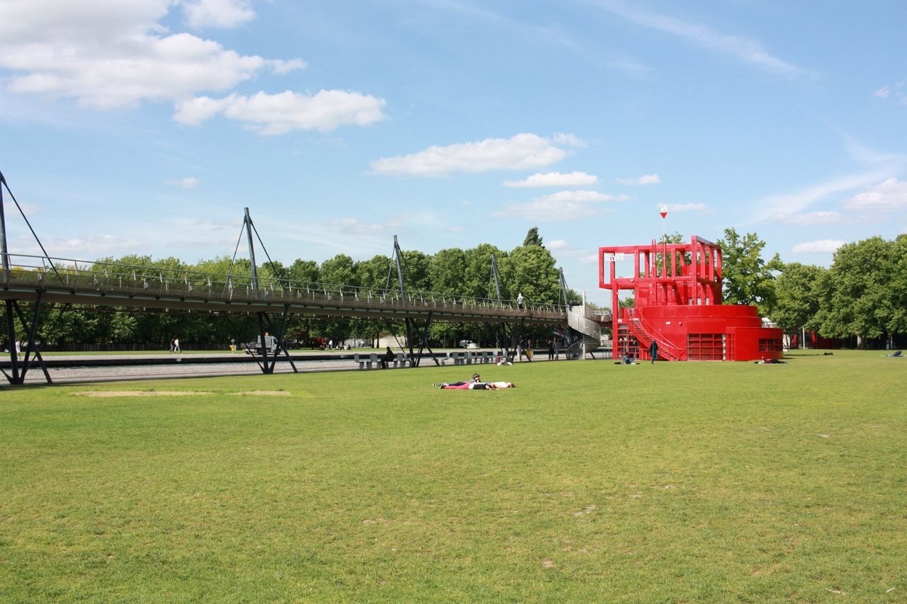
We departed and headed to Parc de la Villette, Bernard Tschumi’s 1980s grid of follies and floating infrastructure projects that define a precinct scale park and collection of public buildings. We sat and had our third picnic session for the day. The pace of the study tour had definitely changed to “croissant mode.” Set among the randomness of this project, again the locals seemed to flock here for their afternoon snacks, for exercise and a jukebox-fuelled park session.

Centre Pompidou

We left Parc de la Vilette and travelled to the Pompidou Centre. A third park typology, this urban square is also packed full of visitors, this time accompanied by mimes, musicians and the various array of creatives that inner city publicity promotes. Paris seems to run on and through it’s parks, and so it was great to experience the contrast between old and new, suburban and inner-urban. The tightly controlled and heritage influenced approach to contemporary architecture seems to encourage extensive use of the provided public spaces. And now we know that Parisians carrying baguettes are so cool because you know they are on their way to relax and converse in a nearby park.

#2015DuluxStudyTour

– Casey Bryant

Day 7: Paris walking

No photos, please, no photos!

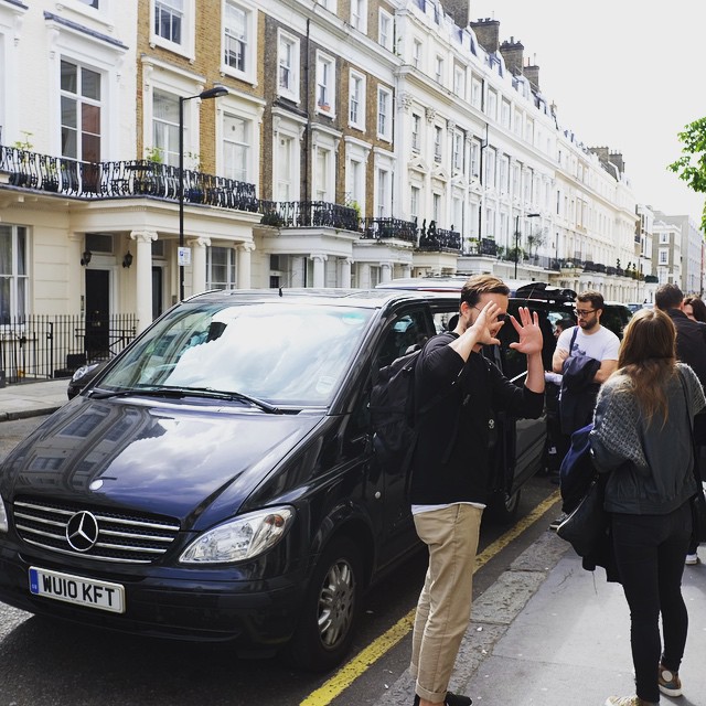
Our time in London ended yesterday with a rockstar exit from the hotel in Paddington via two black Mercedes vans. Nic was not impressed by all the press attention …

Unknown-1

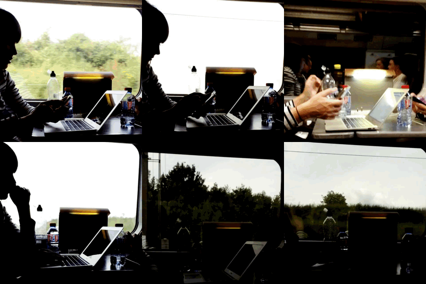
On the Eurostar Katelin made us all work hard prepping articles for ArchitectureAU.com. In reality we were all distracted by the wine and food service (a pleasant surprise), so she was the only one who really did any work!

IMG_2118

Arriving in Paris our bus to the hotel was delayed. While we waited, Oliver, the Dulux dog, went on a little journey in the hands of a thief! I decided to chase after the guy – probably not the smarted thing in the world to do. I think he heard me coming so just put his arm out and he gave me the bag back. I’m not sure if he was trying not to cause a fuss or maybe I am just really scary?

The afternoon was our designated day off. We spent the afternoon lounging together in the Mama Shelter Hotel bar located in the 20th arrondissement with the amazing Chemin de fer de Petite Ceinture abandoned railway by our side.

Clap clap, time to get up!
Day seven actually begins!

First task of the day, while riding the bus on our way to the walking tour of Paris, was to complete the Myers Briggs personality test. Why would such a topic come up on an architectural study tour?  Simple. Jill, a friend of both Katelin and I who lives in Paris (and also writes for ArchitectureAU), will be joining us on our final night. In preparation for this we have decided to present her with our results. Jill is obsessed with personality testing.

The results:

INTJ – Amber
ENTJ – Daniela
ENFJ – Katelin
ENFJ – Monique
INFJ – John
INFJ – Jordy
ESFJ – Casey
ESFJ – Sarah
INTP – Ni
ENTP – Phil
INFP – Bonnie

What does this all mean!? Stay tuned.

Our walking tour guide for the day was the lovely Benjamin from Guiding Architects.

First stop was the National Library of France by Dominique Perrault and James Stirling. This was one of President François Mitterrand first “nation building” projects. I thought of it as a castle for books. Four large archival towers in each corner linked horizontally on the lower levels by offices, reading spaces, and more archival rooms. Like a castle, in the centre was an external space. The external space was a beautiful forest (with no access except for gardeners). Some of the crew found the space sterile and struggled with its lack of connection with the public realm, especially the forest within. The detailing, I must say, was exceptional.

Unknown-3
Photo: Jordy Hewitt

We then crossed a footbridge over the Seine that beautifully dealt with access from upper and lower entries in each side of the bank.

Walking further around this district (a former rail yard), we came across a formerly disused cold store that was taken over by artists. The coordinator of the building appeared and gave an impromptu talk on what was going on and the issues they are facing.

Surrounding this site were new Docklands-esque developments. They were cold and without personality. How will these projects evolve? How long will it take? There was even a Le Corbusier building currently being renovated.

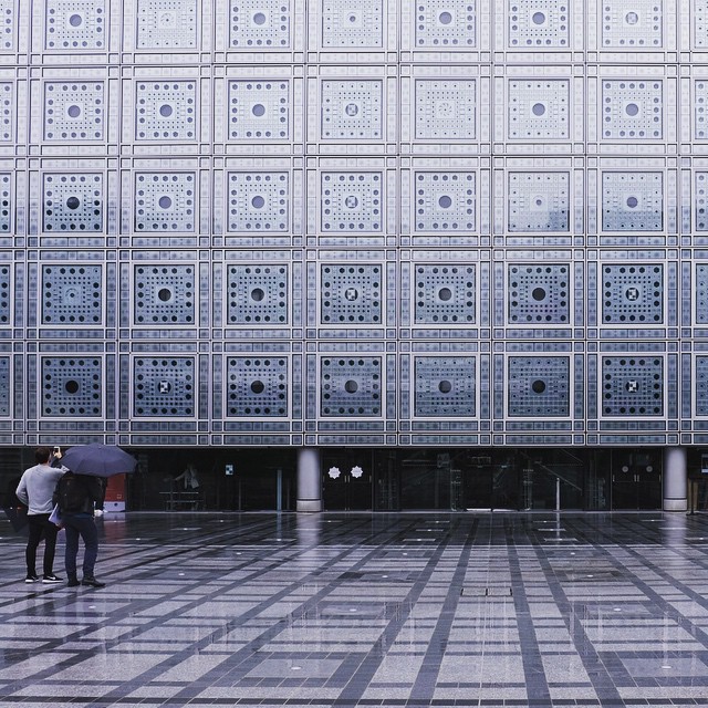
A metro ride took us to the French icons we all studied in school – The Arab Institute by AS.Architecture-Studio and Jean Nouvel. Nic was reminded about how he built a model of the building and facade for a technology subject at school.

Unknown-2

Unknown

Full with Croque Monsieurs, we took another Metro ride to the west of Paris to La Défense.

Unknown-3

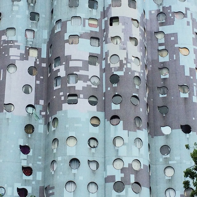
After meandering through a business district comprising a sea of glass and steel towers built in the 1980s, we came across a gem: a social housing project known as Tours Aillaud. Built in the 1970s and (amazingly) named after the architect, the cloud-shaped towers are clad in colourful tiles and are positioned among lush, sail-lined pathways and trees.

Unknown-7

Last stop on the waking tour was Gehry’s new glass Ark for Noah … oh no, I mean €500,000 art gallery for the Louis Vuitton Foundation. I couldn’t help but feel like if been the in same building (almost exactly the same) in Bilbao …

Unknown-6

We finished the day with dinner and drinks at a restaurant that had been recommended by about five locals Palais de Tokyo.


Palais de Tokyo

Don’t forget to follow #2015DuluxStudyTour for the live updates!

Unknown-5

John Ellway

Day 6: London lusting

Dear Kevin,

(Kevin Carmody from Carmody Groake, that is)

We love you.

OLYMPUS DIGITAL CAMERA

You seduced us with your soft and considered words, dripping with poetry and architectural delight. Your charismatic presentation style and consistent eye contact made us feel like you were speaking directly to each of us and that oh-so-often smile could melt the hearts of even the harshest critic. You would ask, “so what do I mean by that?” And then, like any great captain, you’d continue to elaborate on your point. Instead of talking about your practice structure, you showed us the soul of your organisation. And because of this, you had an advantage over the larger firms we visited on the same day, like Foster + Partners and David Chipperfield Architects. Collectively, we felt it was much more useful meeting the directors of firms, which was only possible in medium-sized practices. Having said that, it was particularly interesting observe the immense scale of the larger practices. We also cheated on you briefly with our practice visits to dRMM and Studio Octopi.

dRMM practice visit

Both these offices imparted many actionable takeaways, which was useful and attainably amazing.

Studio Octopi

That night, at the Victoria and Albert Museum exhibition opening party (which Rory Hyde suggested we attend), we discussed trying to replicate your style. Speaking, pausing, connecting, smiling and then continuing. It is extremely difficult, but as a group we have felt inspired to get a coach to help us achieve your level of heartthrob.

It was lovely to end the day connecting with old friends Molly, Simon, Cris and Paul who came to meet the main Dulux crew for drinks – we swiftly relayed the story to them, spreading the love, and now they are also hooked.

We acknowledge this may come across as stalker-like, obsessive, psycho even – but this comes from a place of pure architectural fascination and business learnings.

OLYMPUS DIGITAL CAMERA

Love,

#2015DuluxStudyTour

P.S. Phil still wants an invite back next year.

Day 5: London talking

Achy, grumbly, crampy, sore. All jetlagged to buggery. Mon was milliseconds from face-planting into a street-pole. John was having an existential crisis about whether to wear a suit-jacket or not (he didn’t and he looked fine). I spilt my salt and vinegar chips outside Tate modern and nearly cried. The pigeons rejoiced. The clouds rumbled over. This ‘prize’ had gained inverted commas.

PK_GIF_450

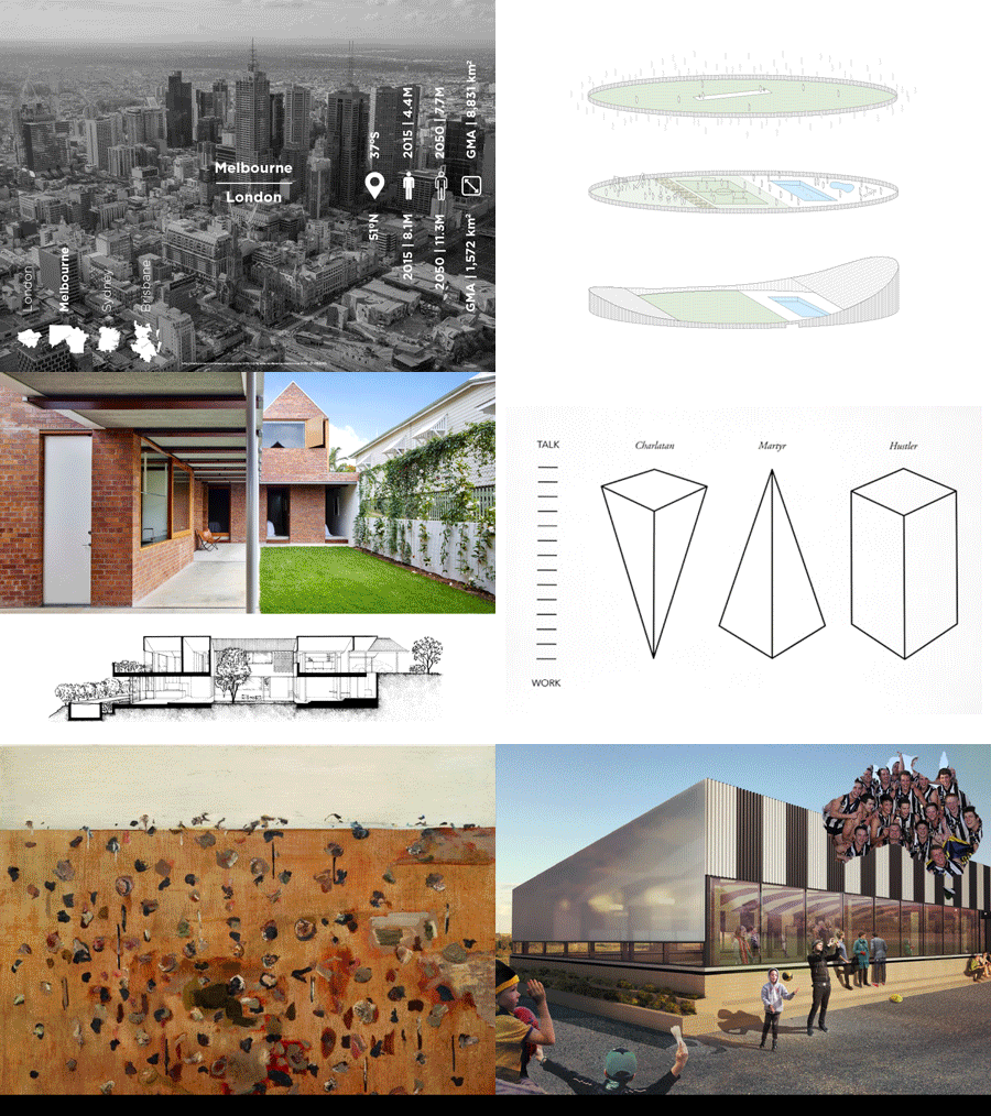
Our set of presentations from the #2015DuluxStudyTour Pecha Kucha at the RIBA

Panicked, the day started over a full English breakfast (of course) with complex file juggling in preparation for our Pecha Kucha presentation that night on the concept of ‘Place.’ If the others were anything like me, they’d cobbled their slideshow together in ten minutes, just hours before getting on the bird, thinking that the evening was too distant to ever arrive.

Well, here it was. The rising reality of having to present at the Royal institute of British Architects (RIBA) to the brightest of Brits and Aussie ex-pats was now very real. Too real. Goddammit.

The great thing was, we had a day chock-full of practice visits to distract us.

It’d be fair to say that after Ken Allison’s brilliant walking tour yesterday which culminated in sunset drinks (prompt: does the sun ever set in London or does it just fizzle away into the low smog?) under the ‘bond-dome’ top-floor at the Gherkin, hopes weren’t so high for the day ahead.

We headed off to Central St Martins for a tour with Stanton Williams and Mel Dodd, the head of tertiary programs there. A masterstroke of itinerary planning (clap clap clap to Dan once again), the two parties spoke apart and separately, giving us two very distinct insights into how an architect and a user present their space. We were left pondering if this building was a glorious factory for art or hideous abandoned shopping centre?

Zaha gallery

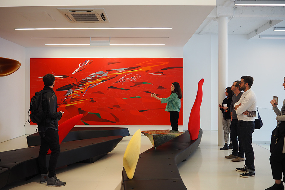
It’s fair to say that Zaha Hadid isn’t a favourite among the group and that’s where we were off to next. Our reservations about her practice – stylised image-making over conscious architecture – weren’t allayed. BUT, the basement of her adjunct Zaha Hadid design gallery was a ripper. This space served as a living archive of the offices discourse, all presented cleanly and beautifully.

Zaha Gallery

We then went on a quick skirt around the perimeter of Tate 2 by Herzog de Meuron, which is about one year off completion. This is going to be something so, so special. A canting, twisting form, skinned in muddy double brick freshly minted from Denmark, it heaves and settles. At the moment, it has its pants around its ankles. However, the intention is clearly legible and it doesn’t take much of a mental bounce to see where this is going to land. However, as much as I have immense love for this building, I think I fell harder for our guide, Kwamina from Herzog and de Meuron. DREAMBOAT.

OLYMPUS DIGITAL CAMERA

WHAT? FINISHED EARLY?! QUICK REST STOP?! HOORAY! WHAT LUXURY!

What should have been a 15 min cross-town sprint back to the hotel becomes a 45 min crawl thanks to the bloody Queen deciding to entertain a small selection of her subjects. Time back at hotel now cut from 45 to 15 minutes.

Off again. All of us now delirious and piled in taxis. Katelin tells us how she forgot which way around you are supposed to wear heel-socks. The answer, not surprisingly, is the right way round.

We’re now descending down a slow step/ramp into the shiny new Make office. The site visit yesterday to their 5 Broadgate building has propagated much debate. We’re pretty sure which side of the coin we all fall on, but we’re still open to see what the practice presents rather than deferring to the singular message from visiting the one building. They present beautifully. There is genuine passion from the leadership and their business practice is exquisite. We left soundly impressed by the craft put into their personal and spatial presentation. We are however seeing a common theme repeating. Is practice in London responding to the shadow of Foster?

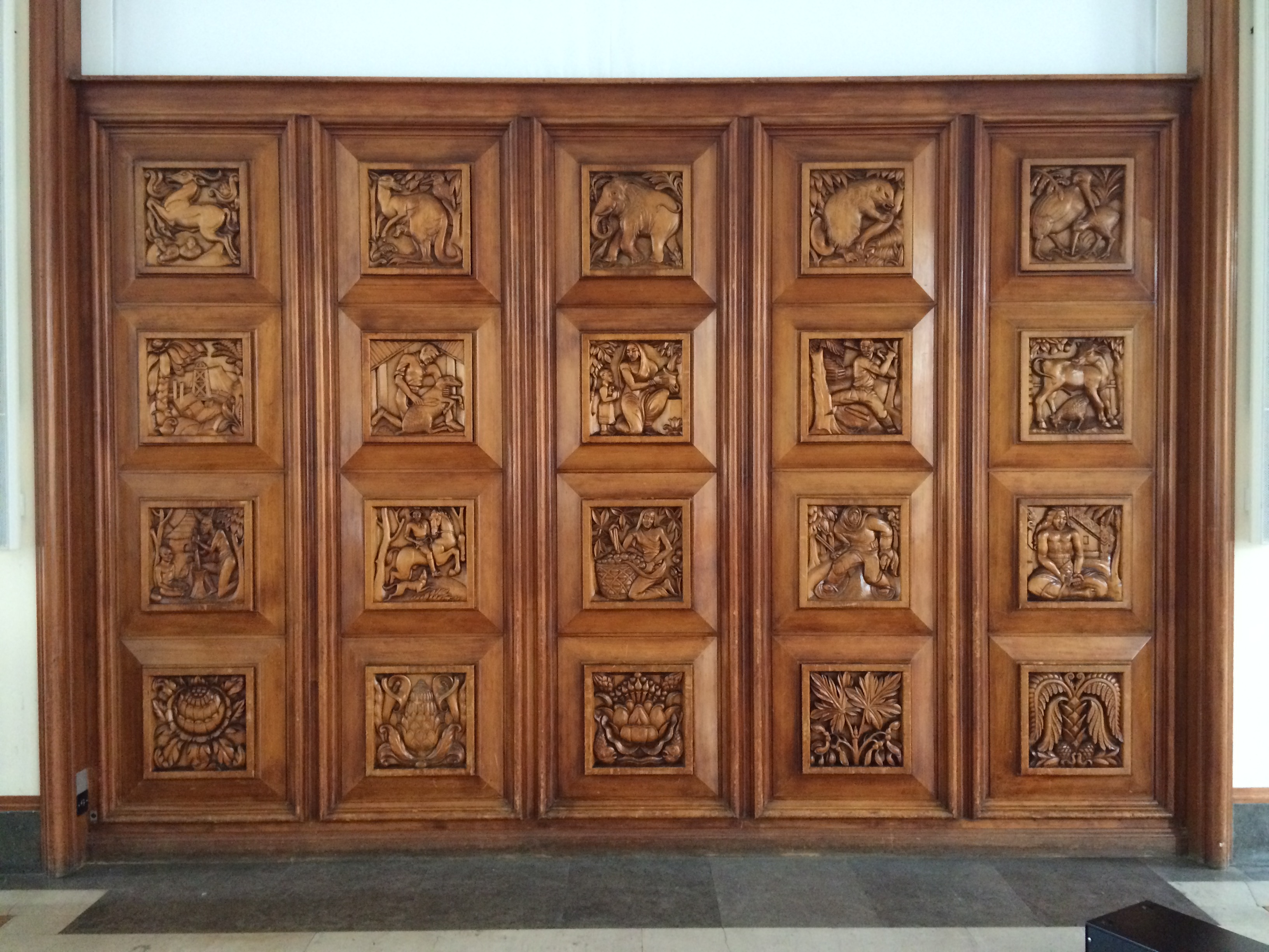
A short walk west and we are swallowed into the gilded gut of RIBA headquarters. Built in 1938, it was envisaged as the metaphorical cupola of the Empire’s achievements. There are embellishments in motif and material throughout referencing the countries of the Commonwealth. Australia, quite obviously, was part of this at the time (and some reason, this arrangement continues in earnest). We get a jarrah room (WA reprazent) and a story board carved into a door featured our indigenous fauna, flora, peoples and industry.

RIBA

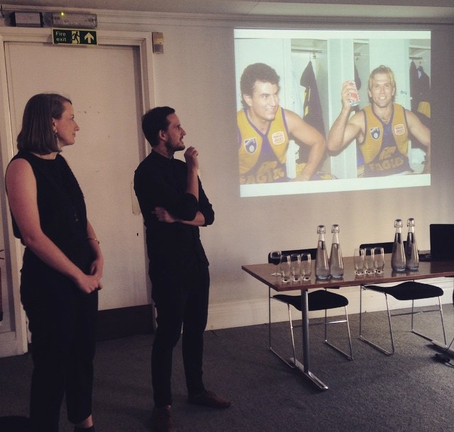
We were all hoping for 15 minutes respite to prepare for Pecha Kucha. No minutes were forthcoming. On with the show. First up were Bonnie, Casey and John addressing the binary and antipodean flip-flop of east-coast Oz to the old country. Casey thought it prudent to bring up the Ashes. He’s a wise man. Their presentation was outstanding and after the bombardment of foreign offices and projects, it was lovely to get a reminder of the wonderful skill of our touring party.

FullSizeRender

Mon and I then brought it home with a three-minute-forty tour-de-force that left the room with minds and hearts exploded and aghast at our blinding colonial brilliance. That’s how I read it, nonetheless [delirium].

Half the marathon run, half still to go.

Don’t forget to follow #2015DuluxStudyTour for the live updates!

– Nic Brunsdon