Day 11 – The last day

The last official day of the tour was epic and saw us embark on a jam packed itinerary, navigating our way around three of New York’s boroughs, touring four projects & visiting five exciting architectural practices – lucky thing we’ve developed a lot of stamina over the past 10 days – nothing like leaving the best til last!

FAMILY NY

An early start saw us in the lovely leafy streets of Greenwich Village visiting the emerging practice of Family NY. Best known for their pioneering and innovative use of architectural crowd funding for the ‘+ Pool’ project, Dong Ping Wong talked to us about the studios exciting entrepreneurial approach to developing their own projects and some of Family’s other exciting commissions … including a house for Kanye and Kim!

It’s hard not to be totally inspired by the ‘Plus Pool’ project which began as a self-initiated Kickstarter campaign to raise money for a speculatively proposed floating community pool in New York. Dong has an amazing passion and conviction in the project. Offering engraved pool tiles and ‘first dips’ as an inducement to support the project, two rounds of Kickstarter has raised over US$350,000, enough money for initial water filtration testing currently underway in the East River. Four possible sites are currently under consideration and the project has, perhaps more critically, gained strong public and community support including from local authorities and some key fund raisers in New York. We really hope this pool gets built!

1400997980585

TOSHIKO MORI & HUDSON YARDS

After a short sunny stop for good coffee (!!) in the Bowery, we negotiated the stairs and made it to the office of Toshiko Mori Architects (TMA). One of the most exciting aspects of Toshiko’s approach is the diversity of work and typologies she undertakes. Pursuing a practice model of diversification Toshiko has four ‘arms’ to her practice – ‘TMA’ focuses on built architecture, ‘VisionArq’ is an urban think-tank, ‘Paracoustica’ a non-profit exploring innovative projects for the developing world, alongside Toshiko’s teaching and studios at Harvard. In her own words: “It’s productive to diversify … and I find it more fun.” A great architectural ethos.

IMG_1204

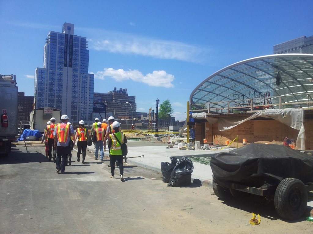
Donning our hardhats we headed uptown to Hudson Yards, Manhattan’s largest current development project for a tour of a series of beautifully detailed and structurally expressive subway station canopies and public pavilions by TMA. In an enormous shift of scale we then ventured into the subway station under construction below, descending via many, many steps to the track level of what will be New York’s deepest subway station. Infrastructurally scaled escalators, mechanical systems and extraction fans dwarfed us and the climb out was quite a feat. Our guides from TMA then took us on a quick visit nearby to their Sean Kelly Gallery, a carefully composed conversion of an existing warehouse building – a sign of the changes happening in this NY neighbourhood.

20140520_114100

LEESER ARCHITECTURE & MUSEUM OF THE MOVING IMAGE

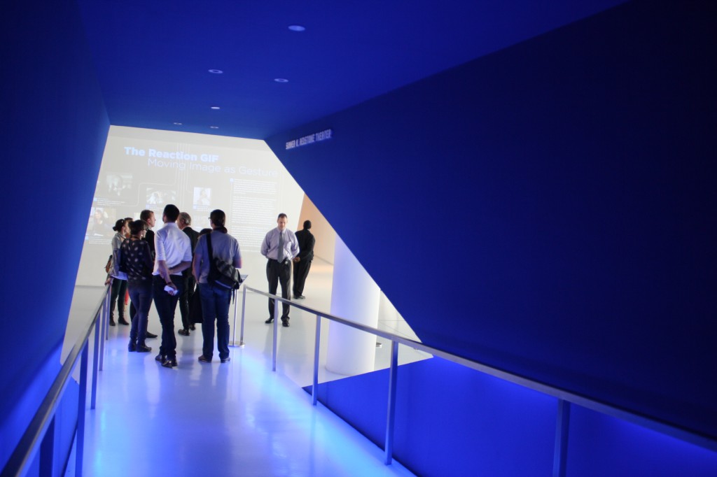
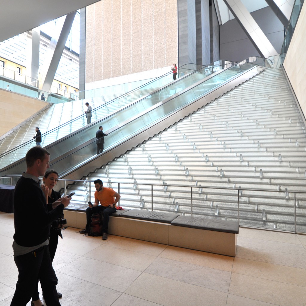
It turns out some taxi drivers in Manhattan don’t know how to get to get off the island, and so after some delay we finally arrived in Astoria, Queens to meet the very generous (and patient) Thomas Leeser who took us on a detailed tour of his immersive ‘Museum of the Moving Image’. The museum contains a curious and expansive collection of moving image history – from Edward Muybridge films to Bladerunner cityscape models and conceptual projective art.

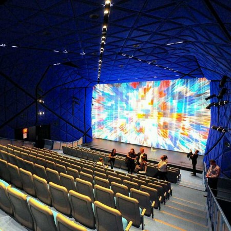
Thomas discussed the development of the project over a 6 year period, from the initial competition winning strategy, through how the project brief expanded from a small scale $2m foyer renovation into becoming a large scale $75m redesign and addition. The shared architectural highlight was the breathtaking klein blue felt lined theatre with its amazingly kinetic multi-coloured curtain – an incredibly cinematic space which is also apparently Martin Scorsese’s favourite spot for a private screening! …well that seems like a pretty convincing review.

IMG_1282

1400997911631

REX

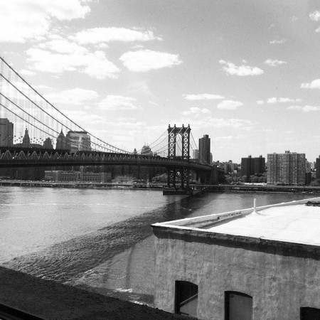
Catching the subway from Queens to Brooklyn we arrived in DUMBO (yet another great New York neighbourhood acronym – Down Under the Manhattan Bridge Overpass). This area of NY is a creative hub (and therefore home to many architects!) in fact REX is located just a few floors up in the same building as Leeser Architects, with an enviable view of the Brooklyn Bridge and across towards the Manhattan skyline.

RexView

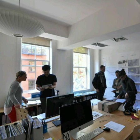
REX’s office was surprisingly quiet … having recently won a competition for the Mercedes-Benz Future Centre in Stuttgart, Germany a large part of the team had headed to Europe to kick start the project. We were able to take sneak peak at the so far undisclosed winning design proposal and also admire the whiteboard diagrams and sketches lining the walls.

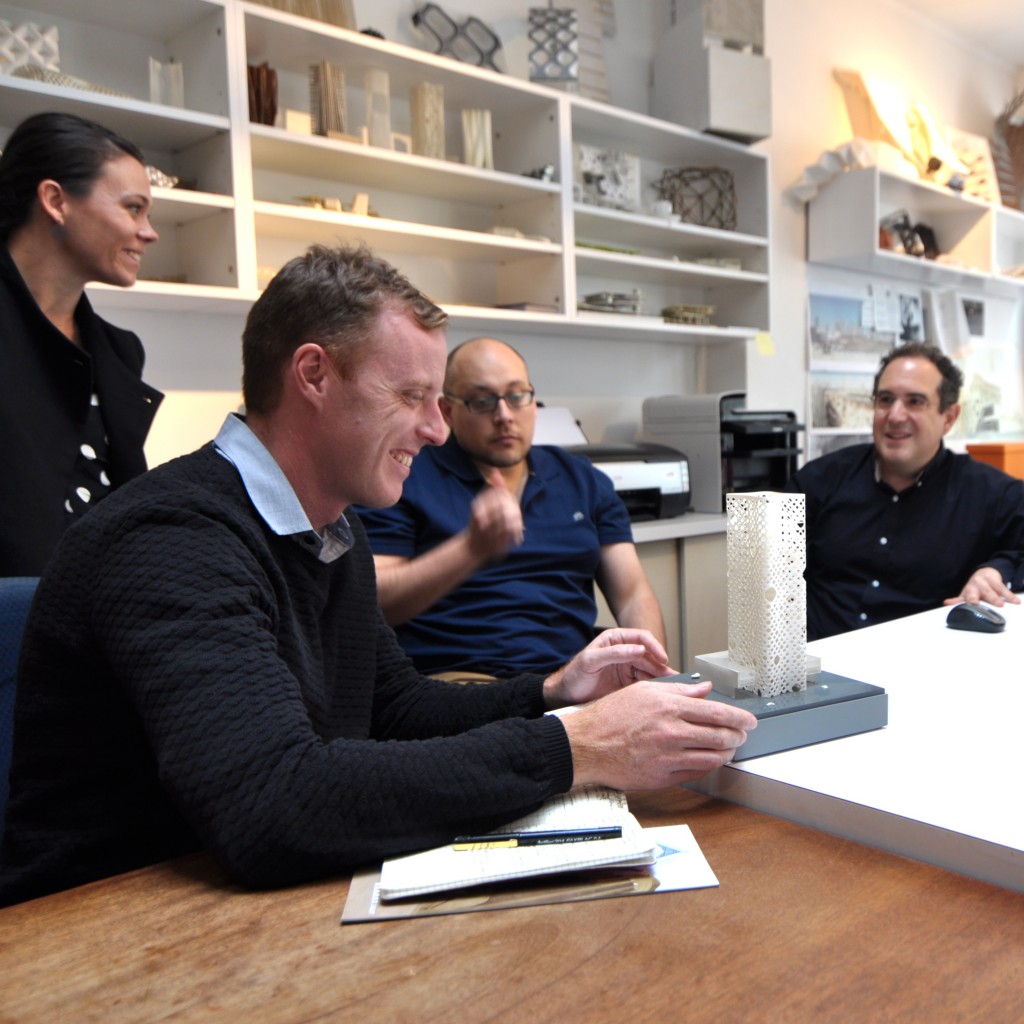
The office is scattered in many models used extensively to both present, test and develop design strategies. We checked out proposals for a couple of the other key projects the office is working on … one a very large scale ‘necklace’ house (actually 5 houses in one) being constructed somewhere in America for a secret client, and the Five Manhattan West project, a large scale retrofit of an existing tower located near Hudson Yards, which is just commencing construction.

SHoP & EAST RIVER PIER

Our final stop was at SHoP – and inspiring it was. Rapidly expanding and recently relocated into the historic Woolworths Building in Downtown Manhattan, Director of Government projects Omar Toro-Vaca took us on a tour of their impressive new digs. The foyer space features the partner’s model aeroplane collection (the second largest in the US) which underscores the importance placed on architectural assembly.

Omar discussed how the practice had grown through an entrepreneurial approach, taking on development risk, more closely integrating consultants, becoming involved in project delivery and construction through forming SHoP Construction, innovating with technology – for example developing apps to streamline construction for the Barclay’s Arena cladding panels, or deliberately adopting a “swim down with the sharks” approach where developer objectives are co-opted for architectural ends such as FAR strategies adopted for their super slender West 57th Street Tower. We also met one of the founder ShoP’s founder Chris Sharples (the SH in SHoP) who almost seemed convinced for a moment to reveal their recent competition winning project in Melbourne for 441 Collins Street – but unfortunately we lucked out there and will have to wait!

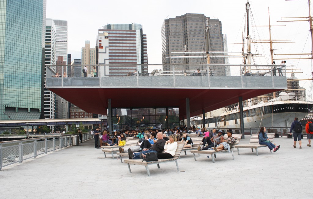
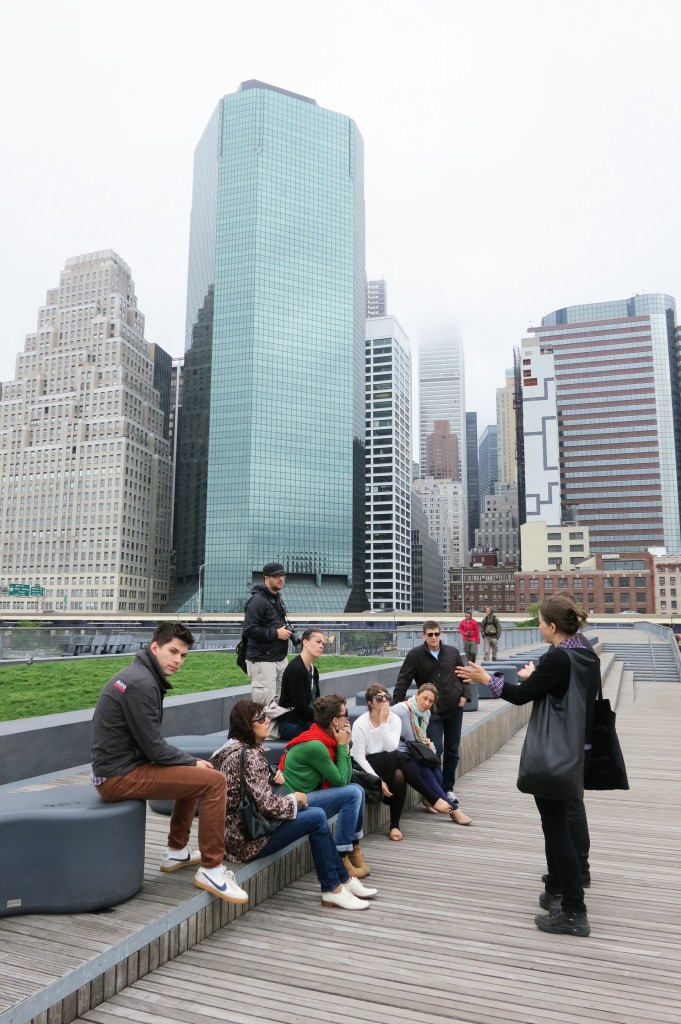
No better way to end the day than a visit with Kathy and Jake from SHoP to Pier 15, part of their East River Waterfront redevelopment, for a project tour and to share some beers overlooking the Brooklyn Bridge.

Pier15

THE END …

Of course this wasn’t really the end … the last day kicked on with dinner at The Mercer Kitchen followed by drinks in SoHo, and the next day with some last minute dashing around New York. Since then we have scattered, some staying on in New York, some heading to the West Coast and others making it all the jetlagged way back home … I’m sure that wherever we all are right now we can’t help but reflect on what an amazing experience this has been, and what a positive impact this tour will have on us all. Thanks for following our travels!
Day 10 – New York practice visits 1

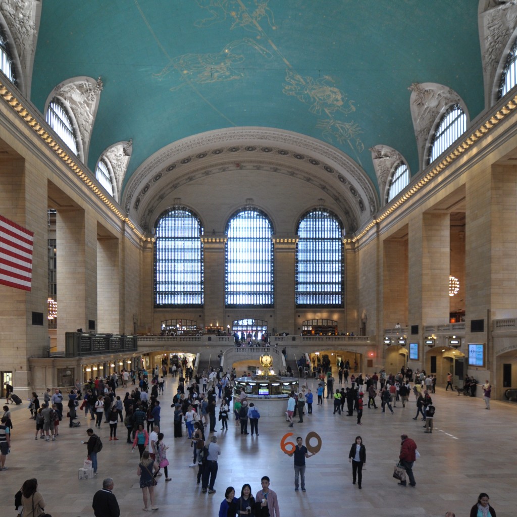
Day 9 was Sunday, and Sunday was a free day in the itinerary. Ben and Cherry went exploring, including a visit to Four Freedoms Park via the cable car. Jenna had a ‘Jenna-day’ which appeared to involve an incredible amount of shopping and sightseeing over a very large area in a relatively small amount of time. Suzannah and Michael checked out some NYC classics including Grand Central, Seagram, Lever House and the Rockefeller Centre. Day 10 was the first of our New York practice visits.DSC_0440

1100 ARCHITECT

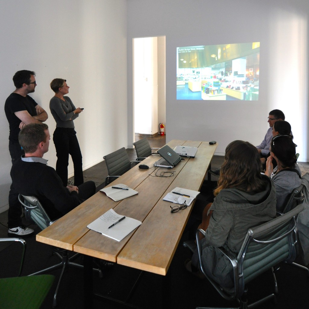
Our first port of call was with ‘eleven hundred’ architects on 10th Avenue. We were greeted by Suzanne and Ed who gave us an overview of the practice. 1100 undertakes a wide variety of typologies placing the emphasis of their work on material quality and relationship to place. In a sense they are a regional New York practice, although the European influence of the directors is clearly evident and they also have an office in Frankfurt. Across all sectors, the work was incredibly controlled and thoroughly detailed and we discussed the research and documentation and staff structure strategies which made this possible. Projects included the MoMA design store, Queens Central Library and a houses in Florida and Long Island. We also lucky enough to meet principals David and Juergen towards the end of the visit who shared some views of the state of architecture in New York with us.DSC_0678

LTL ARCHITECTS

Stop number two was with Paul Lewis of LTL Architects in midtown. Paul is a principal of the practice together with twin brother David and long time collaborator Marc Tsurumaki. He is also active an associate professor at Princeton and Vice President of the New York Architectural League. Needless to say Paul is a busy man, and he shared insights and tactics into running a practice which incorporated academic and extra-curricular activities as well as publishing activities. Keep an eye out for his ‘Manual of Sections’ due out next year – a book about the taxonomy of building sections with over 70 drawn examples. The practice of LTL began with a series of inventive restaurant commissions and has evolved to take on larger scale public and institutional work. Paul encapsulated their approach with the word ‘intensity,’ a suitable word for such a dynamic young practice.DSC_0700

FOSTER + PARTNERS

Third stop on this whirlwind tour was with Chris West of Foster + Partners in the Hearst Tower designed and completed by Foster in 2006. The Hearst Corporation is an enormous media and information company owning US newspapers and international magazines including Good Housekeeping, Cosmopolitan and Oprah. The building is their national headquarters and they occupy the entire building save for half of the 26th floor where Foster has retained an office space (and stunning views). Chris gave us the corporate overview of the Foster practice which employs a staggering 1,100 people with an average age of 34, in 20 offices around the world. In terms of local projects, we were shown the Yale School of Management in New Haven which collected a series of individually expressed teaching spaces around a modern version of an Oxbridge courtyard.DSC_0714

REISER + UMEMOTO

Next we met with Jesse Reiser and Nanako Umemoto of RUR Architecture across on 59th Street. Reiser + Umemoto began in 1984 and have grown slowly over the past thirty years combining intensive teaching with speculative practice. Paul is now Professor at Princeton and Nanako is a Visiting Professor at three other universities. After steadfastly pursuing their ‘argument’ or ’thesis’ through the competition procurement model, the practice has recently won first place in two major international competitions – the Kaohsiung Port Terminal and the Taipei Pop Music Centre, both in Taiwan – which has changed the trajectory of the office. We discussed their O-14 tower in Dubai and the realities of delivering such a building through digital documentation and scripting. Jesse and Nanako also shared their thoughts on the use of academic publishing as an apparatus to push ideas forward.DSC_0744

DILLER SCOFIDIO + RENFRO

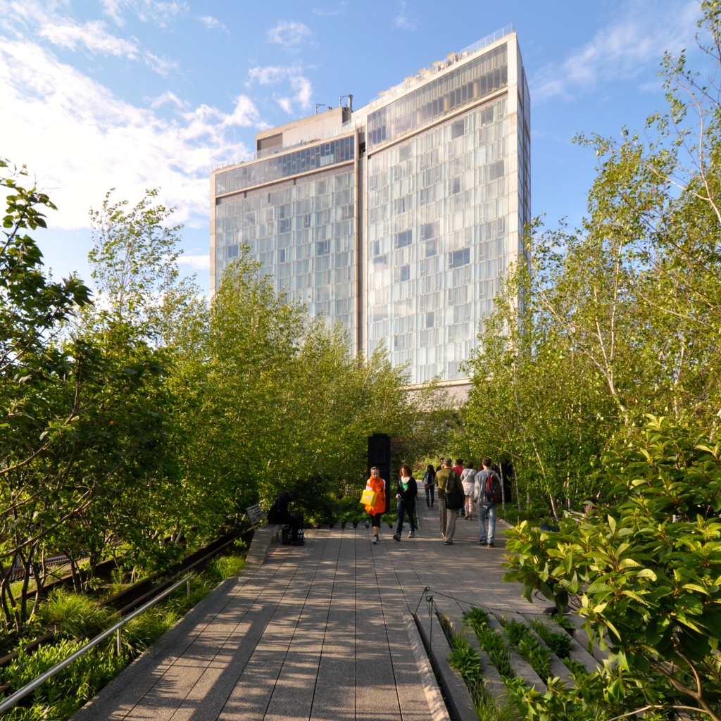
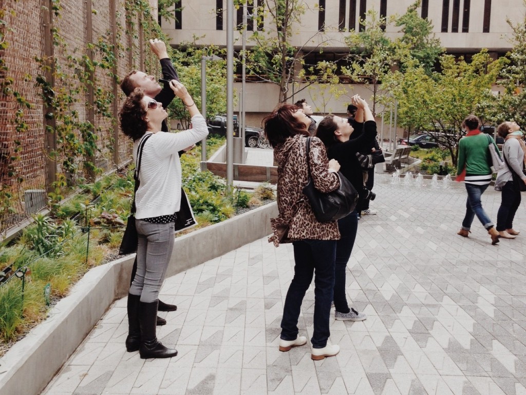
Our final visit for the day was with the office of Diller Scofidio and Renfro in the Starrett-Lehigh Building, a commercial building slash freight terminal occupying an entire city block in Chelsea. Luca Farinelli showed us around the office and introduced us to Matt Ostrow who discussed a number of new projects with us including he Broad Art Museum, Columbia University Medical Centre and the Hudson Yards Culture Shed. We talked about the programmatic particularities and innovations of each project, but broadly on the focus on material innovation and the the use of CATIA in the design process. Our extended tour concluded with a site visit to the nearby High Line project accompanied by Dustin Tobias who had been working on the project for the past three years. We were treated to an in depth explanation of the project, both in its conception and realisation. The High Line quickly became a unanimous favourite. One and a half miles of elevated design.DSC_0919

Day 8 – a trip to The Glass House

Our first Saturday in New York first involved a visit to a TriBeCa apartment designed by Nexus; where our hosts took us through the design process and their impressive collection of art. (Just a side note – one thing that we found particularly interesting is the naming of NYC neighbourhoods – ie TriBeCa = triangle below canal st. Brilliant.)

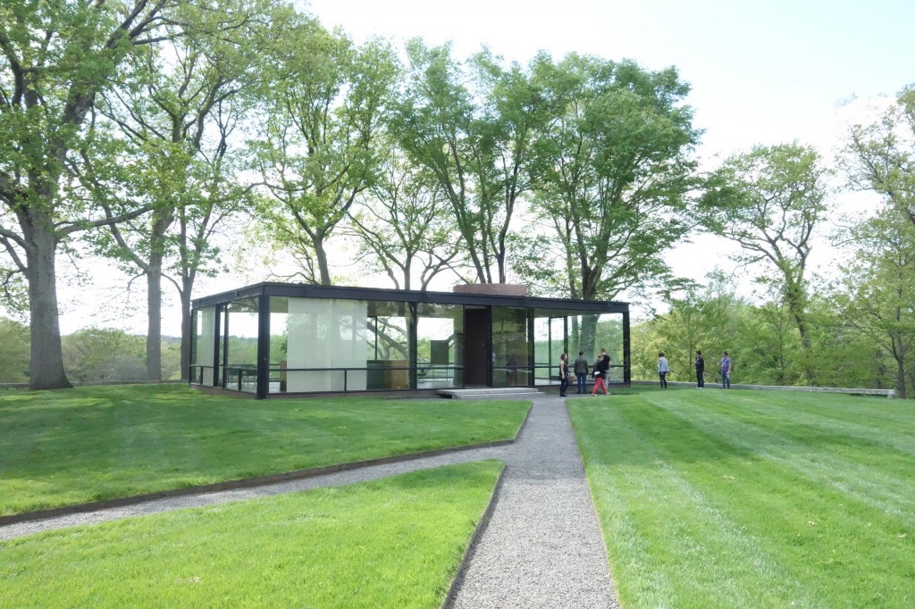
From the TriBeCa apartment, Phil our Dulux sponsor skillfully managed to manouvre and navigate us through the city in a rented minivan out to New Canaan for a visit to Philip Johnson’s Glass House. Having first visited Mies’ Farnsworth House back in Illinois, we were somewhat skeptical if the Glass House would live up to expectation. Our car trip involved much discussion surrounding the way in which we understood Johnson to be a bowerbird of sorts – not displaying a distinct consistent style within his architecture.

However – despite these thoughts; the Glass House was definitely impressive. In comparison to the Farnsworth house, it was a very grounded building due to the dark red brick flooring sitting within the landscape, and the connection back to the Brick House which is sited adjacent to the Glass House. One thing we noted on our post-visit trip home critique was the Farnsworth House has a greater horizontal emphasis, in which you are always looking outwards. This isn’t the case within the Glass House. It may be due to solid the cylindrical brick service core which pierces the volume, or it may be due to the horizontal window mullions.

image

One thing we weren’t completely expecting was the other buildings on the Johnson estate. It was evident that Johnson’s wealth and connection with the who’s-who of the art world (notably Andy Warhol) allowed for him to experiment within his architecture.

image

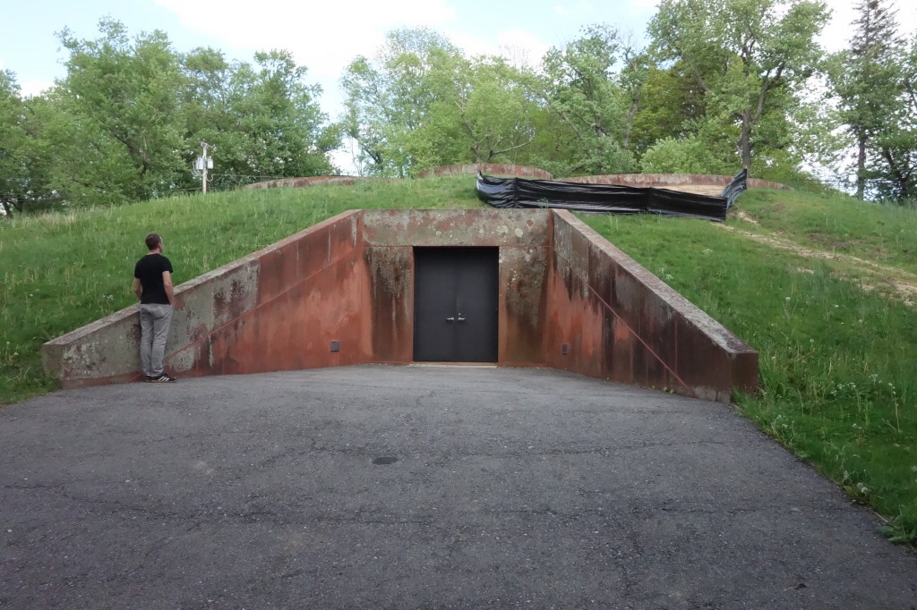
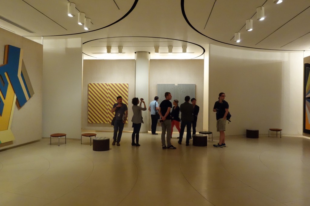
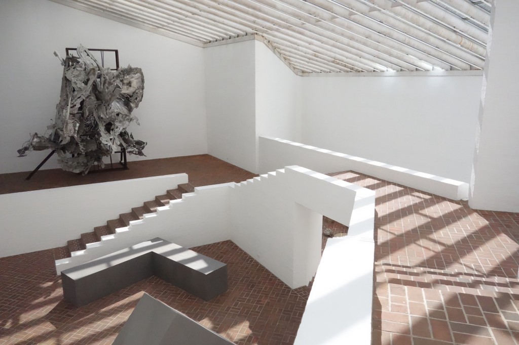
We decided our favourite building on site was actually the underground art bunker. Entered via a slight decline down into a door set within a mound in the landscape, the art gallery’s clover leaf plan held three large rotating double carpet clad panels of art, with many leafs of panels hiding behind the current fixed installation. After some coaxing, we were allowed to one-by-one tuck our heads around the corner to view a lesser known Andy Warhol piece – similar to his postage stamp pieces yet in muted tones.

image

The site itself had many follies and small experimental buildings on it, including his library – being on the site itself reinforced Johnson’s seemingly disparate stylistic approach to his work. What did impress us however, given our previous thoughts that he was just ripping off his contemporaries, was that Johnson admitted in some video footage we were shown that he was not as great an architect as Frank Lloyd Wright or Mies or other ‘giants of the day’ and he outrightly admitted that he was a ‘sniffer-arounder’.

image

Ultimately – he was an experimental architect with the propensity to test both his ideas and ideas of popular stylistic trends of the time – becoming famous due to his connections at that time. We do also have to mention our night out on Saturday – due to an indecisive bunch of very hungry study-tourers we spontaneously selected a restaurant to eat at in the Lower East Side. Cue our foray into a world of crazy aka the Russian Cabaret Tapas bar. Seriously hilarious, and involving many loud sing-a-longs and even more Sun Goddess cocktails, the Russian cabaret tapas bar set the tone of the evening which culminated in a dance off to 80s classics in an underground bar – and finally falling in to bed at 5:30am. Fortunately Sunday was our free day…

Day 7 – The city that never sleeps…

The tour’s first day in New York began with yet another episode of the amazing race. While the metro card system hindered one group’s departure, team Jenna and Cherry (this time joined by Michael and Ben) were once again leading the way; fearlessly navigating the subway to the southern most tip of Manhattan. It was here that we met Bettina, our guide from Guiding Architects New York. Being the first to arrive, there was time to grab a quick coffee from a somewhat intriguing yet run down pavilion. Bettina later informed us that this was in fact the New Amsterdam Plein Pavilion completed by Ben van Berkel / UNStudio in 2010 which had unfortunately never functioned as it was intended due to delayed completion of the adjacent Staten Island Ferry Terminal and damage from Hurricane Sandy in 2012.

The 4-hour walking tour started in Battery Park on the west side where we battled the wild winds and learned of the irregular spread of New York City northwards until the Commissioner’s (Grid) Plan was overlaid in 1811. From here we walked over to the East River Waterfront Project by SHoP Architects, which was completed in collaboration with Ken Smith as part of former Major Bloomberg’s green city initiatives to reconnect the city to the waterfront. Despite the cold, windy weather keeping the sensible people away, it was fantastic to experience the level of thought that went into the design and the diverse ways that people can interact with and occupy public space.

IMG_6824

En-route to the World Trade Centre and Memorial Site, the group obstructed the sidewalk as we cranked our necks to view the overwhelming scale and bulk of the Equitable Building designed by Earnest R. Graham in 1915. It was interesting to learn the public outrage to overshadowing caused from this early skyscraper led to the introduction of the cities zoning and setback laws in 1916.

Processed with VSCOcam with m5 preset

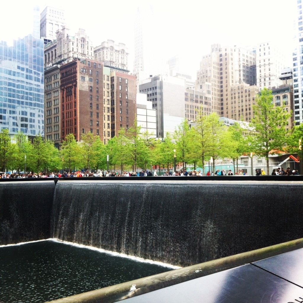
The timing for our visit to the World Trade Centre could not have been better as it was the very first day that the National 911 memorial had been opened to the public without restrictions. The strength of Michael Arad and Peter Walker’s memorial design shone through despite the hoards of tourists; the four walls of water cascading down into the endless tower footprints leaving us with a lasting impression.

photo

The walking tour concluded with a brief pause at The Beekman, Gehry’s first residential tower from 2010 and then onto China Town for some well-earned dumplings. A trip up the Empire State Building had been scheduled into our 18-page itinerary however this was postponed due to the cloudy weather and replaced with free time to explore. Ben, Michael and Suzannah made a B-line straight to the New Museum by SANAA and had raving reviews of the vertical circulation and current exhibition featuring music by Sigor Ros. Jenna and Cherry meanwhile spent the afternoon visiting boutique retail fit-outs in SoHo and NoLIta.

Reconvening once again at ‘The Centre for Architecture’ we met with Rick Bell AIA New York Chapter and heard about the many ways the Institute is reaching out to it’s members and collaborating with other architectural organisations across Manhattan. The information came at us thick and fast – perhaps too fast for our weary selves. It would soon become evident however that we’d have to ditch the jet-lag excuse and ‘lift our game’ if we were to keep up with the pace of the ‘city that never sleeps!’

Day 6 – No sleep till Brooklyn

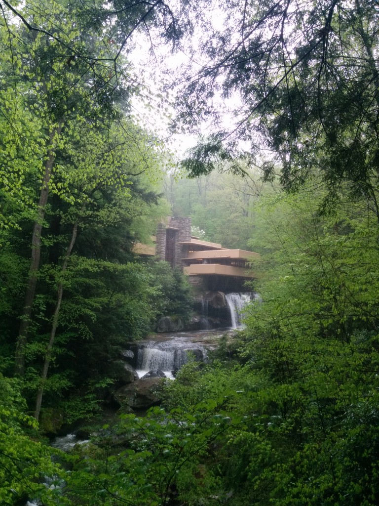
After a late flight into Pittsburgh, we had an early start loading in to our very stylish bus for the drive out to Frank Loyd Wright’s Fallingwater. Fallingwater is spectacular, there is no better way to describe this building – sited over the Bear Run River the building pulls no punches, with expansive cantilevering balconies projecting over the water fall below it is about as dramatic as architecture gets. Spatially and organisationally Fallingwater echoes many of the moves of Unity Temple, directing you through a sequence of spatial compressions and expansions as you spiral via multiple stairs through the principal spaces in the house – although with less drama or organisational innovation than the earlier project.

Frank Loyd Wright's Fallingwater
Frank Loyd Wright’s Fallingwater

For many of us this was a big tick against our archi-tourist bucket list and it seems that for many others this was also the case. We arrived at the same time as four school buses, to be mustered through the visitors centre, and then onto the organised tour with near military efficiency. We are told that Ed Kaufman, son of the of the original clients, donated the building and all of it’s contents to the Western Pennsylvania Conservancy in 1963. The conservancy has maintained the original furnishings allowing for a glimpse of the while building as FLW originally intended and as the Kaufman’s had lived with.

The contrast with our earlier visit to the Farnsworth house is striking; Mies and Wright, arguably the most influential of all American architects, yet Wright seems to have captured the public imagination, while Mies and his most famous residential project remain a niche interest. This may be something to do with their personalities. Famously brash, confident and working his way up from nothing, Wright seems to fit the American ideal of the architect, whereas Mies by all accounts was reserved, intellectual and guarded his privacy. Perhaps more importantly, while Fallingater and the Farnsworth house were completed within 10 years of one another, and were equally innovative and shocking where completed, Meisian ideas and aesthetics have become ubiquitous, to the point where many of his buildings (particularly at the IIT Campus) now seem mundane and pedestrian. Fallingwater retains its ability to inspire both for its compositional spectacle, but also because of its singularity – there is simply no other house like it in the world.

After Fallingwater, we pile back into the bus to complete the road trip to New York. After many hours, a little karaoke, and some spectacular moves from Phil, we catch our first glimpse of New York City. Driving into the city for this little party of exhausted travellers was amazing – all the more so for the great dance moves at the back of the bus. We finally arrive at our house in Manhattan, ready for our first full day in the city tomorrow.


Day 5 – Battle of the Classics – Mies vs Frank

It’s not often you visit two of modernism’s 20th century masterpieces within the space of a few hours – but this was the challenging and exciting prospect facing the tour on our final day in Chicago. Frank Lloyd Wright and Mies van der Rohe were both prolific contributors to the architecture of Chicago. Wright’s Unity Temple and Mies’ Crown Hall are key projects which clearly affirm the design agendas and philosophies of each architect. In many ways the two projects share a strong conviction of innovating with new materials and spatial strategies, but as we were to discover this was achieved in divergent ways.


IIT & CROWN HALL

IMG_20140514_132954-2

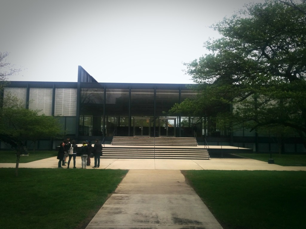
First stop was IIT – Illinois Institute of Technology. Channelling a “more is less” philosophy, our student guide led us on an exploration of both the IIT campus masterplan and the campus centrepiece Crown Hall. For the tourers this providing for a classic study in Miesian design moves – the grid implemented as organising device both at the urban and building scale, structural innovation with steel and glass, and horizontal planes and platforms framing an expansive space light, reflective and expansive space. The subterranean black reflective library space being a particular highlight.
Across the campus dotted with multiple Miesian moments, Crown Hall lookalike buildings by SOM fooled some and provided an interesting case study in modernist deception, transforming many of Mies ‘truthful’ structural and material strategies into aesthetic adaptations. (Thanks to Jenna for coining the new architectural terminology of FoMo – Faux Modern). We also explored the more recent contemporary additions to the campus of OMA’s McCormick Student Centre & Helmet Jahn’s student housing.

IMG_0054


OAK PARK & UNITY TEMPLE

IMG_0133

Led by the lyrical and learned Larry from Off the Track, we then ventured out to Oak Park located on the southern edge of Chicago city, a revealing journey of shifting urban and socioeconomic circumstances from highrise downtown via the gentrifying suburbs of Wicker Park and Logan Square, and through the challenging urban outskirts. Beyond this the commuter suburb of Oak Park is strangely and perhaps cinematically familiar – a typical middle American garden suburb of timber clad homes with manicured lawns and swinging front porch seats.

Oak Park contains a vast collection of Frank Lloyd Wright projects. Our tour of the suburb included Wrights own home and studio and revealed the evolution of Wright’s residential innovations and experimentations between 1889 and 1913.
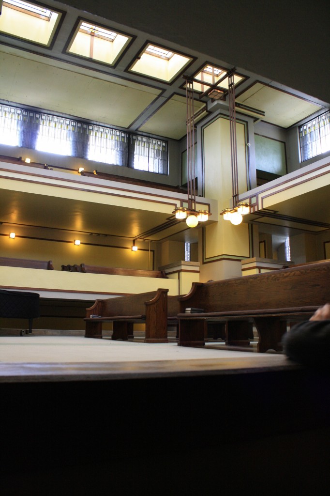
A collective highlight was Unity Temple, which surprised us all with its internal spatial complexity, intertwined circulation paths and vertically interconnected series of spaces. Layered vertical spaces in the main temple space provided many spaces for the tourers to sit and contemplate multiple perspectives, lighting and material details. Sara and Phil from Dulux also seemed to be enjoying the grey,blue and green interior colour palette.


DEBATES IN TRANSIT

IMG_20140518_104615
There’s nothing like a long security queue and delayed flight at Chicago O’Hare to spark an architectural debate, so putting aside all our preconceived notions, aesthetic preferences and ideological positions; the tourers had it out. Unity vs Crown… the singular, horizontally expansive and unified spatiality of Mies vs the interconnected, vertically layered and compressive spaces of Frank. The verdict was close (and perhaps a mute point) with an initial tie being broken by forcing the fence sitter in our midst into a decision. And so with a margin of 3-2 it seems in the end the tourers came down on the side of spatial complexity. Round 1 to Frank.

Day 4 – Chicago practice visits 2

RONAN ARCHITECTS

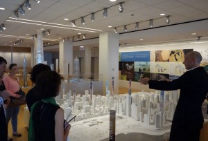
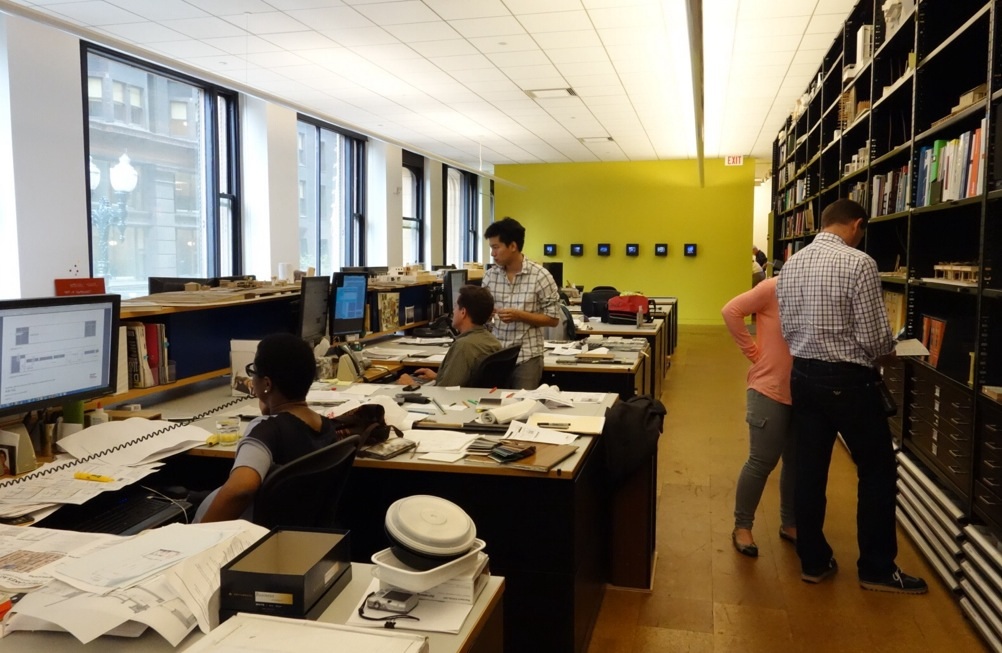
Our first stop today was the office of Ronan Architects, a first floor concrete loft located outside the Chicago city centre. The incredibly generous John Ronan talked to us about his fifteen year old practice and fielded questions about project procurement and how his practice operated. He walked us through walls full of drawings and desks full of models of recent competitions and projects including the Gary Comer Youth Centre, a ‘transformational’ project for a neighbourhood in South Chicago. John then took us across to Ronan Architects’ most well known project to date, the Poetry Foundation, only a couple of blocks away. His explanation of the seductive screen to the street, beautifully proportioned volumes, attention to detail and material execution were inspirational.  DSC_0906

KRUECK AND SEXTON

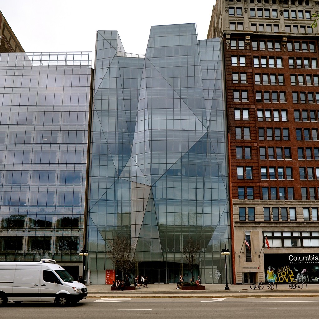
John kindly offered to accompany us to our next appointment with Krueck and Sexton. We met with Thomas Jacobs who gave us the practice history, an evolution from a small residential practice to a firm now undertaking major public and government commissions. Tom entertained us with his recent experience in renovating Crown Hall at the Illinois Institute of Technology where a single mullion detail was the subject of nine months of heated debate with the ‘Mies Police.’ We then cabbed it downtown to check out their Spertus Institute on Michigan Avenue. Yugene and Andreas gave us the full tour with special attention to the innovative facade which broke with the historic streetscape.DSC_0945

SMITH AND GILL

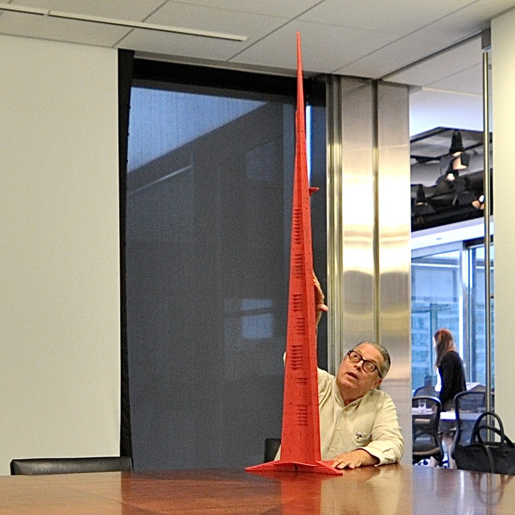
After burritos, chips and guacamole for lunch, it was time to up the scale. Our next meeting was with John Burcher on the 23rd floor of the 1960s SOM classic 111 West Monroe building. Smith and Gill specialise in the ‘super-tall’ tower and are the authors of the world’s tallest building, the Burj Khalifa in Dubai. They are also working on the future world’s tallest building the Kingdom Tower in Jeddah, which will be one kilometre tall. When asked how high it was possible to go with the new technology, John just smiled and said ‘the sky’s the limit.’ With a long history working within Chicago practices, John regaled us with stories of SOM at its height, with over 5,000 staff and a tea lady pushing the trolley between the drafting desk offering ‘hot nuts at four!’. DSC_0999

STRAWN SIERRALTA

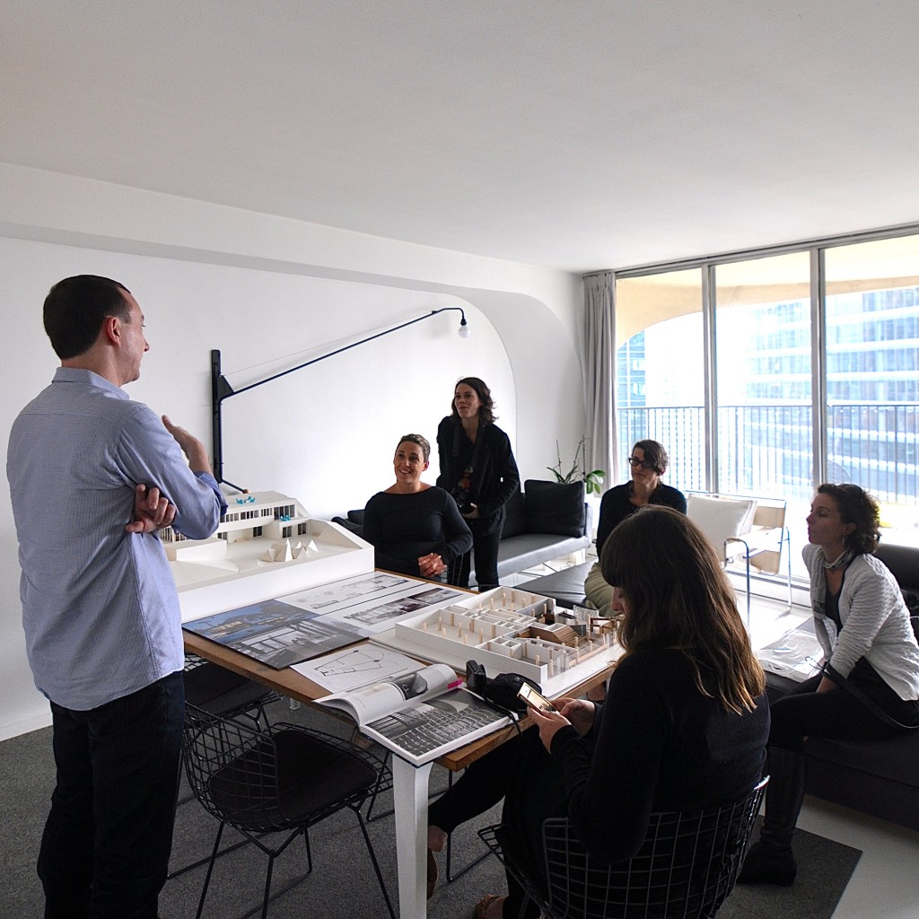
Our final practice visit for the day was with husband-wife duo Brian and Karla of Strawn Sierralta. We were graciously invited into their home-office, a renovated one bedroom apartment in Bertrand Goldberg’s Marina Towers. Maintaining a small architectural practice together, Karla also teaches full time at IIT whilst Brian has a consultancy in design thinking and strategy. Needless to say, our young group felt many parallels with these guys and we swapped stories on their balcony and checked out the top floor laundry and roof top for 360 degree views of Chicago. DSC_0022

CHICAGO ARCHITECTURE FOUNDATION TALK

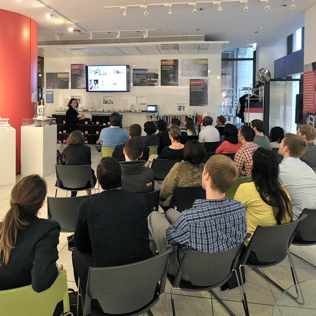
Brian and Karla are also the co-presidents of the Chicago Architectural Club, and organised for the DST crew to speak about their own work to a local audience. The presentations were well-received (even though Ben cheated and went over time) and were followed by a lively and engaged ‘q and a’ session. This was also the first time we had really got to see each others work which gave us an insight into each others practices making for new discussions over dinner. After some serious burger action at the Little Goat Diner, Phil suggested a blues bar. What a brilliant way to spend our last night in Chicago. Entertained by the dulcet tones Charlie Love and his Silky Smooth Band alongside diva Shirley Johnson, we tapped, boogied and drank Jen-and-tonics into the wee hours of the morning. DSC_0094

Day 3 – Chicago Practice Visits

After a well-needed rest, Day 3 began with the group rushing off to begin our first series of Chicago practice visits. Before we go on to tell you about the practices we visited, it is worth mentioning that by this stage, we had a developed understanding of both the way in which the built environment developed within the city, which was further iterated in the meeting of the four practices. SOM The first practice we met with was

SOM.
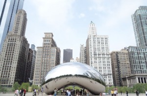
For those that aren’t aware – SOM are one of the largest and most influential practices within Chicago and across America, and have been in practice since 1936. They have had much to do with the development of the city, and have sky scrapers scattered across Chicago. Doug at SOM ran us through current projects related to the city, most notably their work with the redevelopment of the millenium Park – furthering the Burnham Plan of Chicago which was undertaken in 1909. The main focus was furthering the connection between the city and the lakefront. We were taken for a tour throughout the park, which we all agreed was a brilliant piece of urban design – reinforcing why SOM have had such influence on the development of the city over the years.

PORT

The next practice we visited was the very talented Andrew Moddrell of PORT, in his office in the Monadnock building (the tallest full masonry building). From the beginning Andy was very engaging, particularly given many of us could relate to him as directors of young practices. Andy ran through many of his innovative and highly creative urban design propositions, most notably his Denver City Park City Loop project (definitely worth following this hyperlink!) Andy was also very generous with his time, taking us on a walk down Dearborn St- a street on which Mies’ post office complex sits alongside many influential chicago architecture projects.

WHEELER KEARNS

Across the road from the Monadnock building sits the practice of Wheeler Kearns. Dan Wheeler took us through their practice, explaining their method of practice. It was great to see the hand made iterative models that the practice use; and we were equally as enamoured with the large plate of gummy bears on the meeting room table arrival. Dan also pulled us out of the office for another walk down Dearborn St; during which he told us further architectural anecdotes, building on the story of the city and furthering developing our understanding of this place.

STUDIO GANG

Our last visit for the afternoon was the office of Studio Gang. We were shown a body of works that the practice had undertaken, it was interesting to note the practice took on projects irrespective of typology and scale – the practice was interested in developing projects with a design potential. It was great to see the extensive materiality research, and the use of models in the design development of the projects. What was most notable about visiting each of these practices was the passion and knowledge they held for their cities Architecture. This was evident in their enthusiasm to take us outside, to walk down the street and to point out their favourite buildings.

Day 2 [aka page 6 of itinerary)

In an attempt to ward off our jet lag, we met at the hotel lobby to go on an early morning neighbourhood exploration. Except for Ben. There are a lot of amazing cute little Art Deco buildings in the neighbourhood we are staying In – more on this later!
PART A:
Post our morning walk we jumped in cabs downtown to explore the skyscrapers of Chicago through a river based boat tour run by the Chicago Architecture Foundation. Highlights include towers by SOM (who we are going to visit tomorrow morning) and learning how Chicago has a predilection for passing off their buildings form as ‘contextualism’.

PART B:
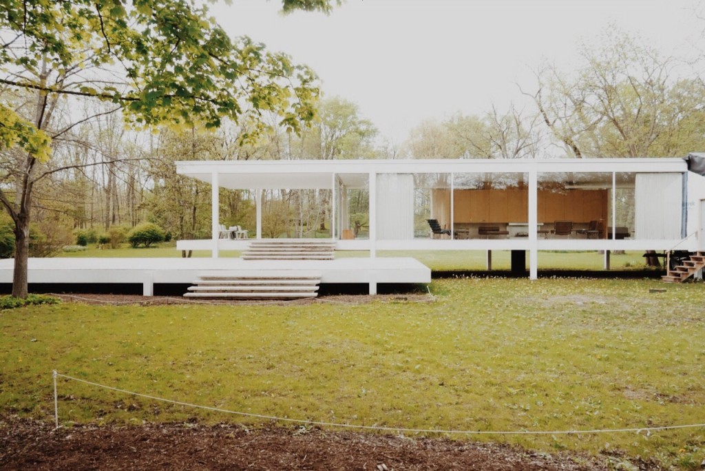
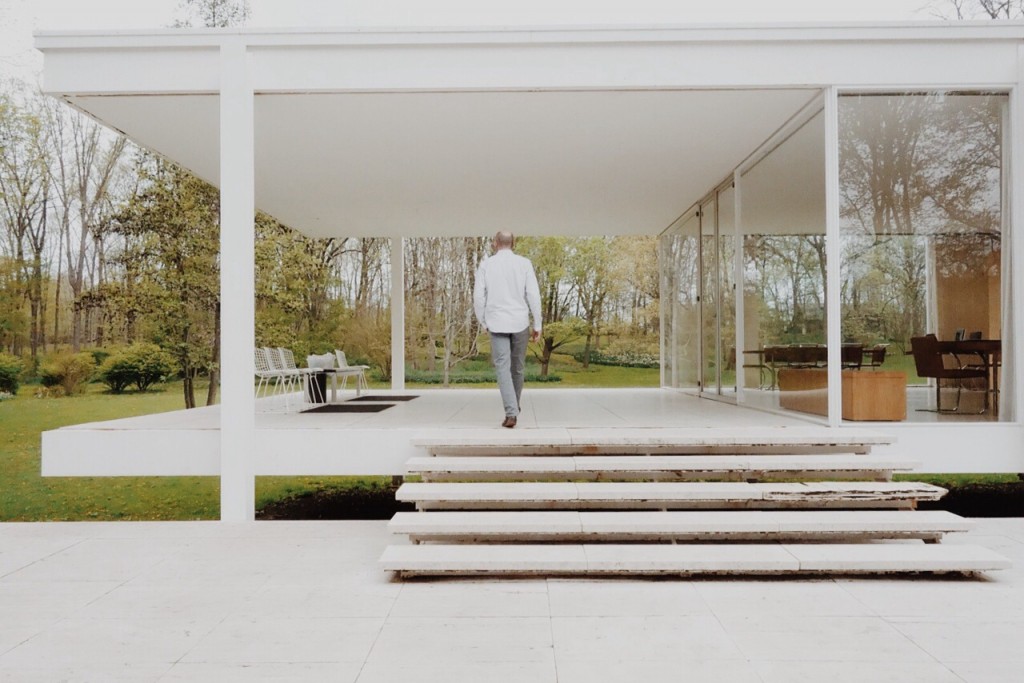
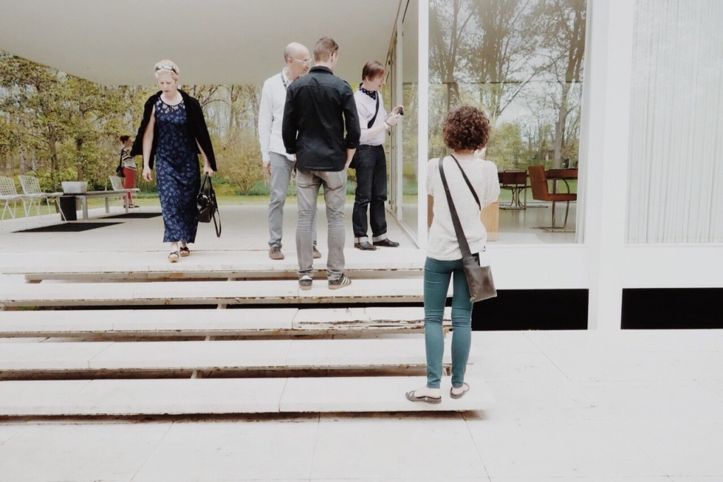
Then we met Larry. Larry was our exceptional tour guide who had a background in architecture history, and more notably, worked as a voice over artist. Larry drove us 1.5 hours down to Plano, where he took us on a tour of Mies van der Rohe’s Farnsworth house (given we begged Bernadette to add it to our jam-packed itinerary).

The two things that stood out to us were its positioning against a noisy highway that now backs onto the property, and how the building is showing a few wrinkles – particularly due to the flood damage over rising river levels over past decades.

image

image

image

Processed with VSCOcam with m5 preset

Ps: We definitely recommend visiting – Google ‘off the map architectural excursions’. As a true Mies aficionado, on our way home Larry detoured us past the Lakeshore Drive apartments – in which he fortunately used to own an apartment

Are we there yet…..

image1-1024x1024_RR

Day 1 of this year’s Dulux Study Tour is an extraordinarily long one, with crossing the date line somewhere over the pacific apparently it is still Saturday nearly 48 hours after we left Australia Saturday morning.

According to the theory of relativity, the you travel faster the more subjective time slows down. Paradoxically it seems the same thing is happening in LAX, except we are not moving anywhere, let alone fast.

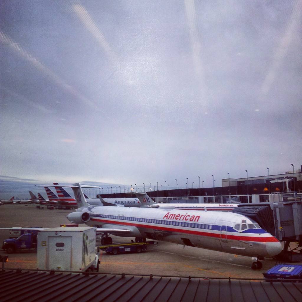
Apparently the pilot for our flight has been misplaced. I am not sure how you lose a captain of a commercial airline, I honestly think that America Airline should keep closer tabs on them, maybe get one of those things that you put on your key ring so that when you clap they beep and you can find them – or in our case put them in the cockpit and fly our damn plane to Chicago.

Now they have us boarding, but have not found the captain, Sarah is worried that they are going start calling for volunteers from the passengers to fly the plane – this is not going to end well.

Wait, the captain has arrived and we are pushing back from the terminal, 4 more hours and here we come Chicago….

(Meanwhile, Jenna and Cherry had no issues, and likened the first leg of the journey to the amazing race, given team Sydney arrived 5 hours before the others and had a brilliant pilot who took it upon himself to commentate the journey)