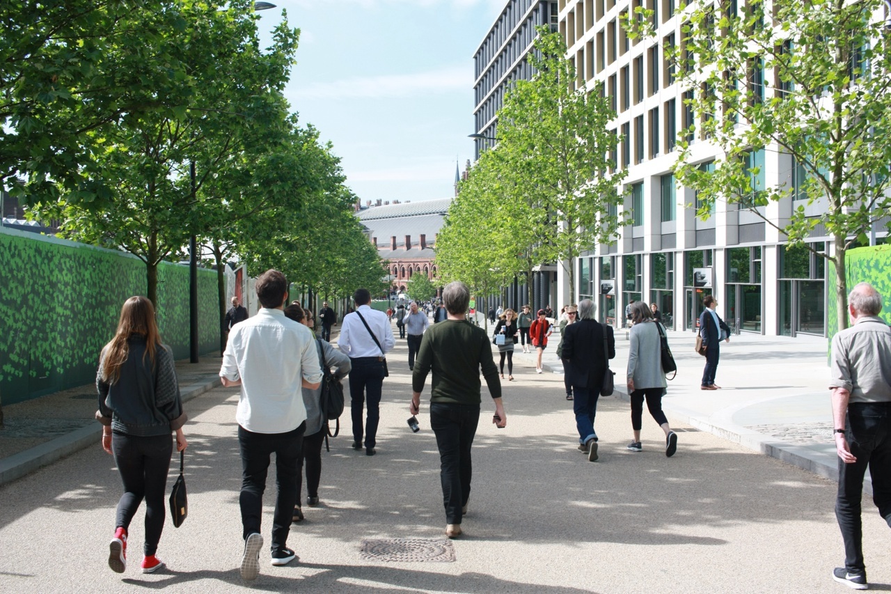
After 13 hours of flight time, an awkward coach ride through too-tight-for-buses streets, two pints and a pie at the local, and a well-deserved full night’s sleep, the 2015 Dulux Study Tour arrived in London. More than just language, food and weather, Day 4 of the tour highlighted many interesting contrasts between Tokyo and London. The day’s walking tour highlighted differences between the predominant types of work being done by architects in each country, as well as the priorities evident in each city.
Ken Allinson, architect, writer and knowledge powerhouse, met us in the morning with an exuberance that did not fault once for the rest of the day. Phil White of Dulux had mentioned many times that this would be a highlight of the tour, and we were all buzzing to be shown around a new city. Ken took us to 27 building, including two tours by their architects, two panoramas of the city, and one very special tour inside a Barbican apartment. This included buildings by Foster, Rogers, Grimshaw, Chipperfield, Renzo Piano, and David Adjaye, just to name a few.
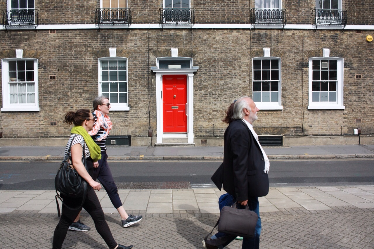
First up was the new Kings Cross development precinct, including Pancras Square, Granary Square, and a range of residential developments that surround. On the way however, Ken took a small detail through the top of Soho to show us two buildings by Amanda Levete, and the The Photographers’ Gallery by O’Donnell + Tuomey. All three buildings presented only as facades, tightly hemmed in by the density of the inner city, and a later social media commentary spawned on by a post by Houses editor Katelin Butler (excellently covering the tour’s proceedings, as usual) raised the question of context. The contextual responses of the buildings we saw later became a theme for the day.
The Kings Cross redevelopment is a mega project with dozens of new buildings being erected behind Kings Cross and St Pancras stations. Hemed in by train line, arterial road and tight grained heritage, the development is an island of new architecture. Two recently completed buildings by Chipperfield and Allies and Morrison, form the first stage of the Pancras Square office development and flank one side of a boulevard leading away from the station. The two are similar in size and floorplate, but are treated with very different facades. The first adorns a grid of brazenly expressed columns, each clad in a filigree of wrought iron, the second adopts a more subtle approach through a shifting of window geometries up the height of the building. Together, they were a good introduction to the series of office buildings we were to see today. They are examples of putting forward a strong facade, but a adopting a flexible approach that is tenant and public centred. In my opinion, the architecture places second place to the user experience. It will be interesting to see how this office precinct evolves and if this approach remains consistent.
Further along an we quickly popped through Central Saint Martens College by Stanton Williams. Aware that we would be returning here at a later date for a tour by its architect, we quickly continued on to explore the residential surrounds of the site. The north of the development hosts several new apartment buildings in various stages of completion. We had a closer look at Kings Cross Arthouse by dRMM, and noticed the differences in approach to housing across the site. Where Arthouse priorities solar and ventilation amenity, others seemed prioritise density and convenience. Quickly noticable was the range of materials and construction types present across the development, Arthouse with its lightweight panelists cladding, others with a brick facade. Ken noted that the brick facade was really coming back into popularity as target markets sought a link to the material heritage and grain of London.
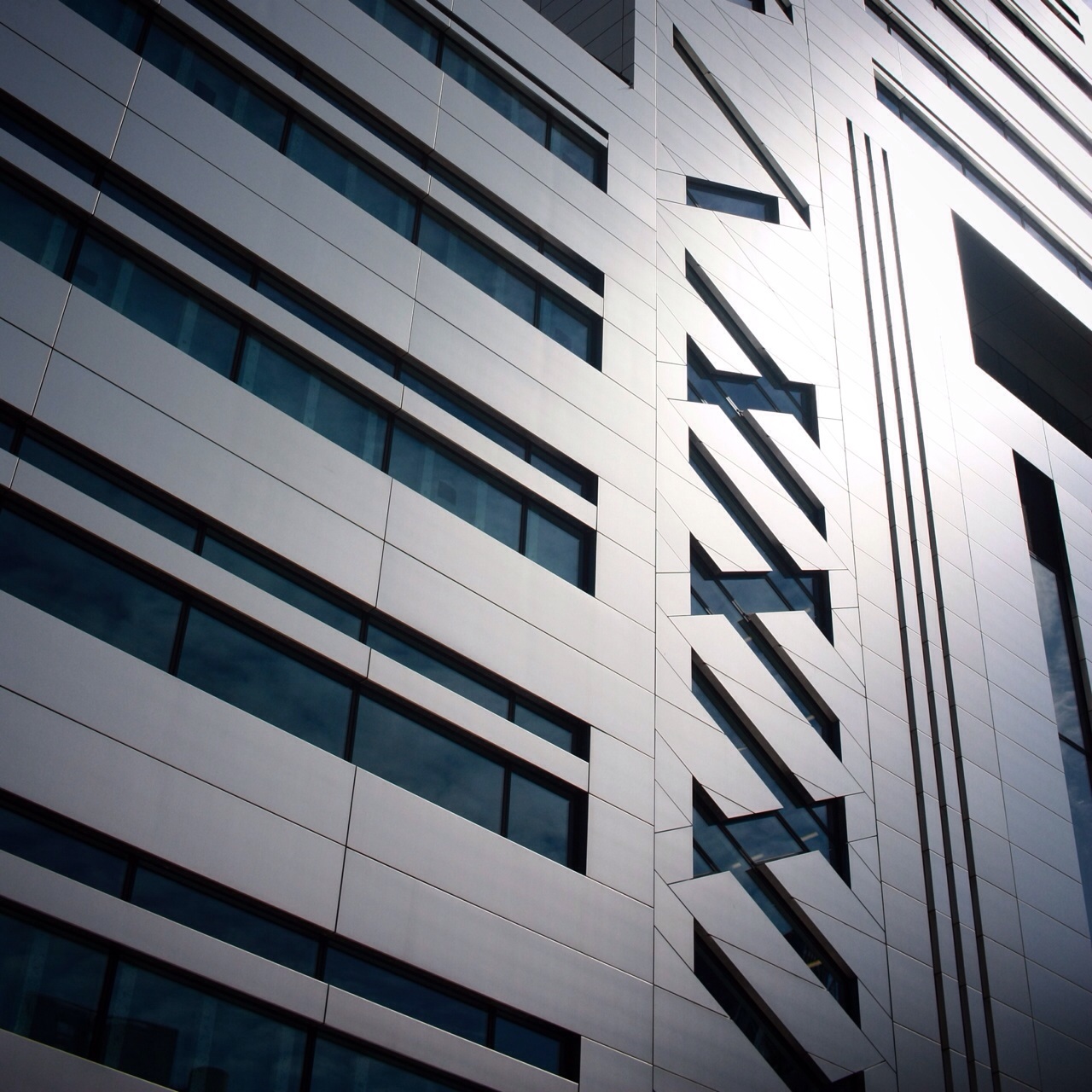
Back on the tube and we arrived at Broadgate Circle. We went on a hardhat tour of 5 Broadgate building, a 120m long by 60m wide by 60m high “groundscraper” to house the UBS in a centralised building. Previously scattered around the Circle, in two collections of buildings by Arup and SOM, 5 Broadgate will be a contrasting new home of stainless steel and voluminous terraces and atria.
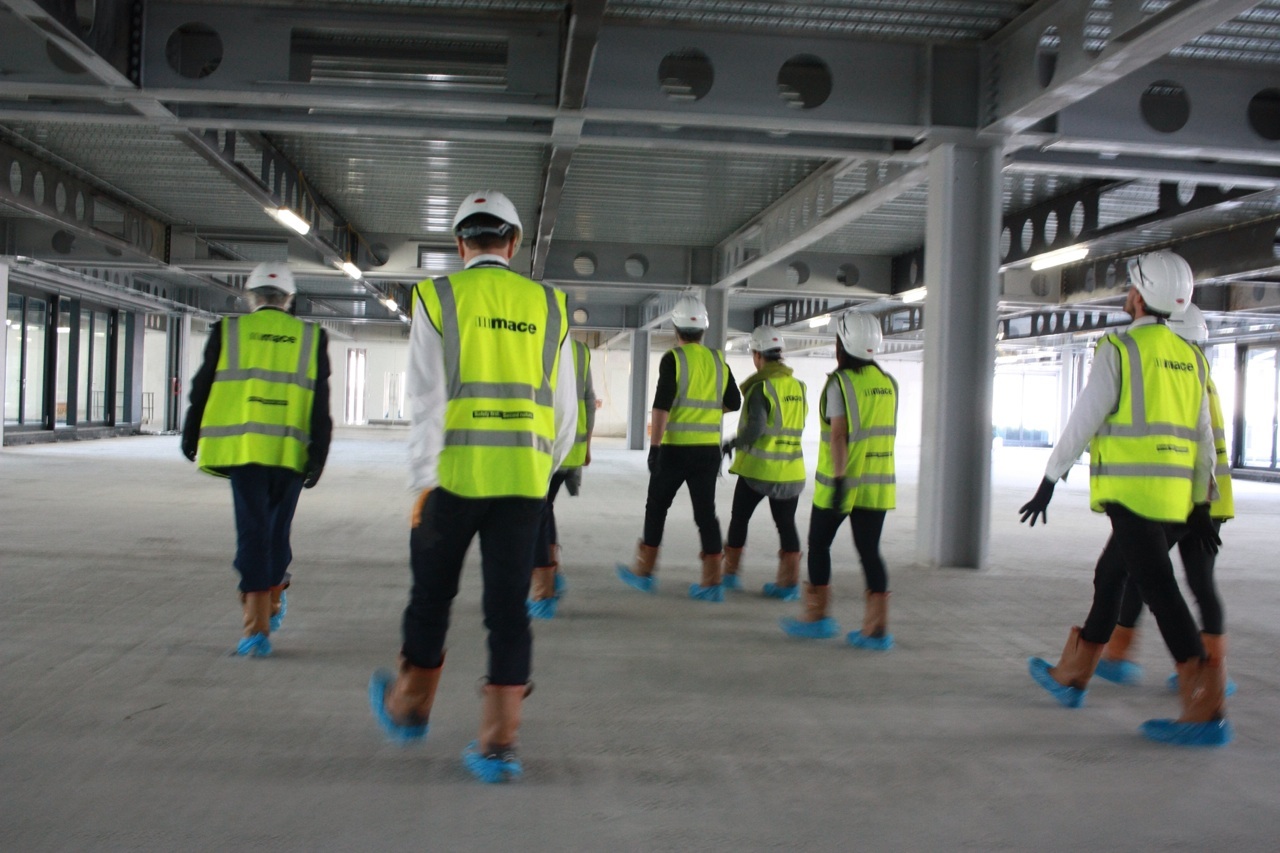
Adorning luxurious amounts of PPE, we were taken through the bustling construction site by Joanna, the project architect from Make Architects, and discovered a vastly different form of office building. Large open plates for trading floors, marble and stainless steel mesh lined lobbies and a floor dedicated to client entertainment are all UBS centric design features. Less obvious are the sustainability initiatives, including a facade only 35 percent glazed, ventilating light tubes and a host of composite recycled materials.
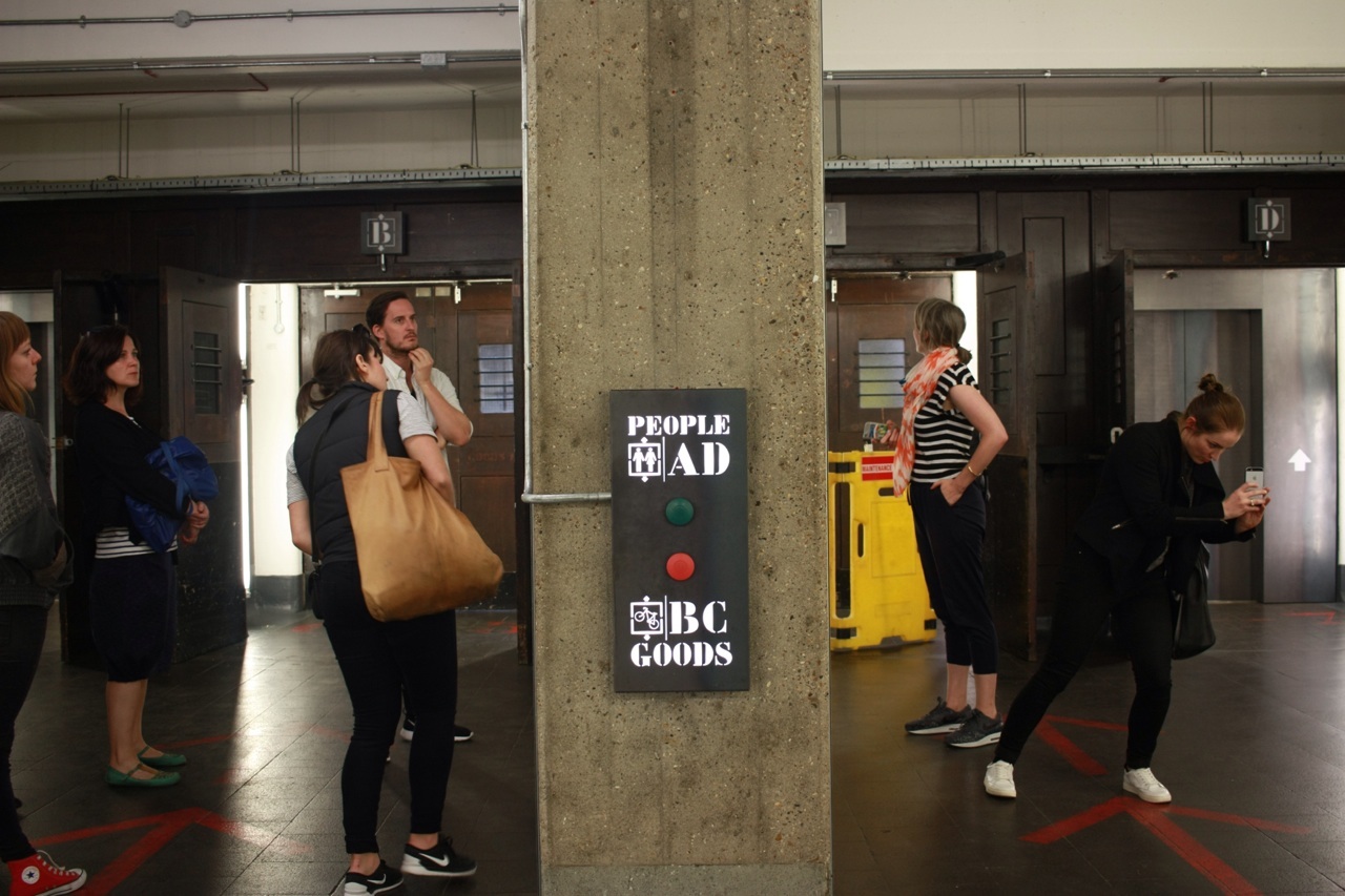
Diverting south for a few hours, we went to the top of The Shard by Renzo Piano, for a panorama of the city, and enjoyed lunch at Borough Markets. Back in East London, we were taken on a tour of the Tea Building and Shoreditch House. In a radically different approach to office design from 5 Broadgate, an old smoke house has been consolidated into seven floors of rambling tenancies. The strategy embraces the quirks and characters of the original, assisted by modern approaches to energy sharing and lighting. Each creative start-up we visited displayed the same ideals if soft intervention, and personal graphics adorned the white painted bricks and columns.
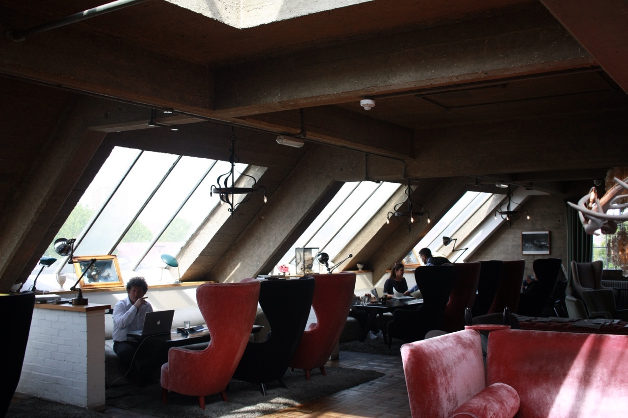
Shoreditch House adopted the same agenda to renovation, and began with similarly humble industrial origins. However, instead of creative agencies, the tenants are a boutique hotel and private club. Also flush with East London industrial chic, there is a sense of opulence given to the old concrete and wrought iron.
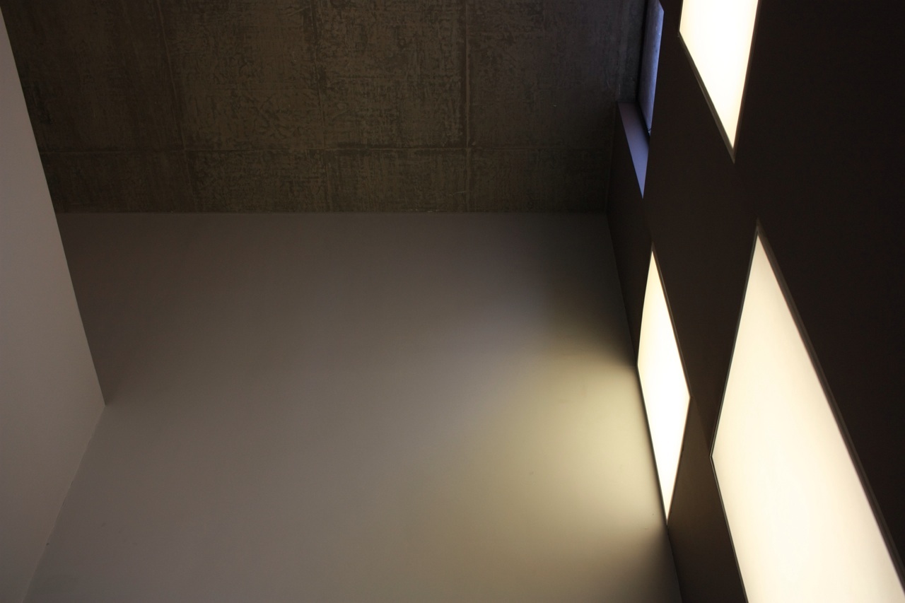
A short walk took us via two David Adjaye buildings, both on tightly constrained urban sites. Each design makes use of the closely cropped viewing angle of the visitor, and manipulates the scale and repetition of window and wall proportions to intrigue and invite. Further on and we arrived at the Barbican. This amazing brutalist enclave is a playground of terraces and gardens, forms and details. Opened by the Queen in 1982, this modern ideal of urban living is both expansive and intriguing.
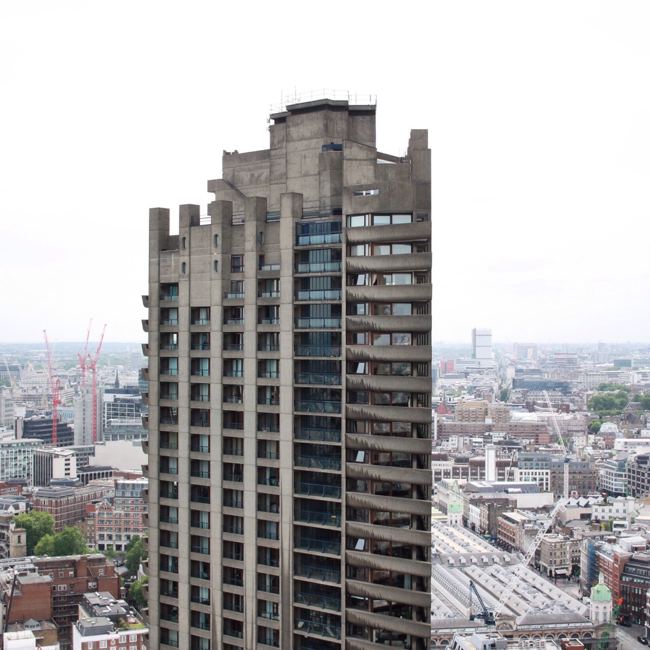
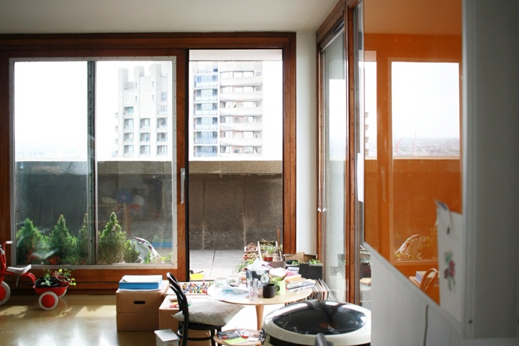
Sky walkways shoot over massive courtyards, artificial lakes and cafés. We were incredibly lucky to be invited into one of the apartments for a look at the original (and protected) interiors. The innovation in these homes is amazing, with custom locking hardware on external glazing, and sliding door panels to the kitchen and bedrooms to create flexibility. The wrap-around balconies give a generosity to each room of the otherwise compact apartment. Everything in these apartments is listed and so cannot be changed, but it is hard to think of a reason why you would want to. The Barbican’s complex of art venues, offices and pedestrian streets is immense and somewhat foreboding, but it does remind you of a time when urban design and housing agendas where far more optimistic and experimental. You can help but wonder what this part of London would be like had the pedestrian sky bridges and internal streets continued further into the surrounds.
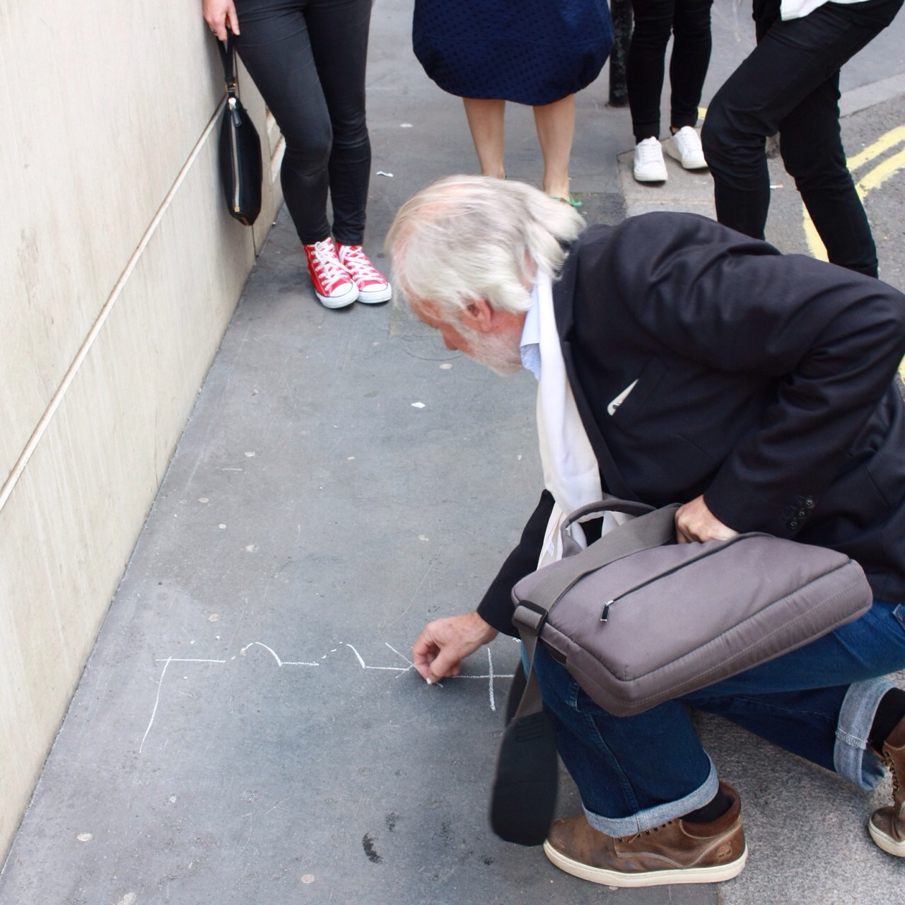
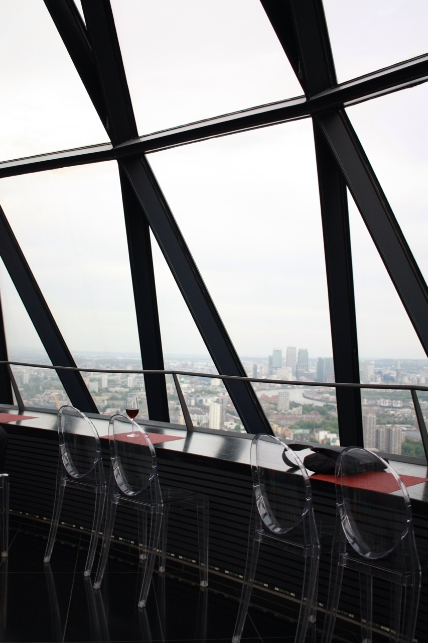
Our last stop was the top floor bar of 30 St Mary’s axe (affectionately known as the Gherkin). It was a great privilege to be able to accompany Ken and his wife Victoria to this prestigious and memorable bar. En route, Ken stopped to pull out his chalk, and after walking around two Fosters buildings (avoiding obvious security cameras), spent ten minutes mapping out the history and subsequent planning of London. An intriguing and clear insight into the systems of this dense city, it was the perfect penultimate tour stop to summarise the relative meaning of what we saw today. Full to bursting with newly gleaned archi facts, the rest of the evening was spent eating, drinking, and discussing the comparisons of London architectural practices.
Don’t forget to follow #2015DuluxStudyTour for the live updates!
– Casey Bryant
